25 Best Product Video Examples for Marketing of 2026!

Co-founder of Yum Yum Videos | Explainer Video & Video Marketing Expert
Product marketing videos can reduce uncertainty before a buyer books a demo, starts a trial, or makes a purchase. A SaaS platform may need to make an invisible workflow concrete, while a physical product may need to prove build quality, materials, or movement on camera.
I picked these 25 product video examples for 2026 because each solves a different communication or production problem. Some come from projects by Yum Yum Videos, while others come from Apple, Nike, Slack, Adobe, Rolex, GoPro, and other brands. You will see product demos, product showcase videos, product commercials, technical explainers, and videos built around software interfaces.
25 Best Product Video Examples for Marketing
What Is a Product Video?
A product video is built around a specific product or service. It shows what the product does, how it works, what problem it solves, and, when useful, what it looks like in actual use. This can be achieved through many different formats, depending on the product. Live footage, screen recordings, animation, macro photography, interface overlays, or a combination of formats.
Animoto’s 2014 Online and Mobile Video Study surveyed 1,000 U.S. consumers. 96% said videos were helpful when making purchase decisions online, and 73% said they were more likely to buy after watching a video that explained a product or service.
For software and apps, a product video can put a workflow on screen that would otherwise require several paragraphs to explain. For physical products, video can reveal scale, materials, movement, assembly, and real use in ways that static images cannot.
25 Product Video Examples, Grouped by What They Need to Do
I find product videos easier to compare when they are grouped by the job they are doing. A software walkthrough solves a different problem from a product commercial, and a technical explainer has different constraints from a lifestyle piece.
Product Demos and Software Workflows
These videos make interfaces, workflows, and digital products easier to see in action.
1. Amazon Coins: Animated Product Video by Yum Yum Videos
Amazon Coins presented a simple production problem. The product was digital currency, so there was nothing physical to film. An interface recording could show the clicks, while animation could give the currency a recognizable visual identity.
For this project, Yum Yum Videos created a coin character that moves through the video as the narration explains how users can earn and spend Amazon Coins. The character gives the viewer something concrete to follow while the video explains an otherwise abstract product.
When the product exists mainly as code or data, animation can provide a visual center. Here, the coin character becomes the visual anchor for earning and spending digital currency, so the audience has something consistent to follow throughout the explanation.
I’ve seen the same problem with other software and SaaS projects. In the Branch case study, for example, the challenge was turning mobile linking and attribution into something a mixed audience could understand without first learning the technical architecture.
2. Recognize: Product Marketing Video With Live Action and Motion Graphics
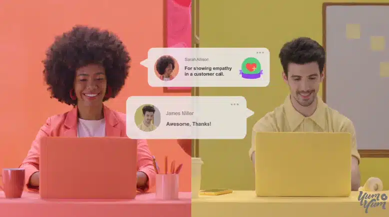
Recognize needed to explain the software and keep its users visible at the same time. Live footage establishes familiar workplace situations, while animated interface callouts point to the software features mentioned in the script.
The two formats have separate jobs here. The actors give the product a recognizable workplace context, and the motion graphics show exactly what the software is doing.
3. Slack: Product Feature Video With an In App UI Demonstration
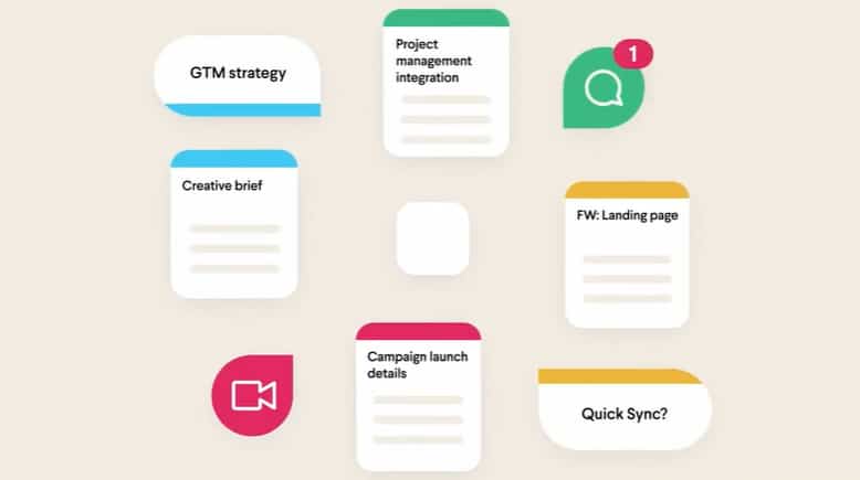
Slack puts the interface at the center of the explanation. As the narrator describes a workflow, the screen performs the relevant action at the same moment, connecting each feature name directly to what the viewer sees.
A good product demo video should reduce the mental work required from the viewer.
4. Monday.com: A Longer Product Walkthrough
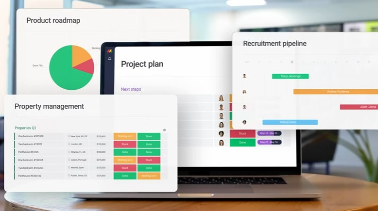
Monday.com has too much functionality for a tiny spot. The video spends more time on the platform so the narrator can move through several use cases while the interface shows each feature in practice.
Runtime should match the amount of information the buyer needs. Cutting thirty seconds can remove context that makes a workflow understandable, so every section needs a clear explanatory job.
5. AirTM: 2D Process Explainer
Cross border financial services involve a lot of backend steps that are difficult to explain in film because much of the value happens out of sight.
AirTM uses 2D animation to turn those steps into a visible sequence. Transactions move across the screen, each stage has a clear visual role, and the viewer can follow what happens without having to understand the entire financial infrastructure behind the platform.
Animation is especially useful when the product itself cannot be filmed in a meaningful way. Payments, data movement, insurance exchanges, logistics systems, software logic. All of these abstract elements become easier to understand once the process has a visual path.
6. HubSpot: Workplace Scenarios Before the Software
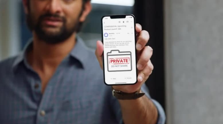
HubSpot’s video begins with recognizable workplace friction.
The humor gives the viewer a reason to care about the problem before the software appears as the answer. By the time the interface enters the story, the product is solving a situation the audience already understands.
Software becomes easier to sell when a relatable situation makes it clear to viewers why the feature matters.
7. Adobe: Product Feature Video Focused on the Output
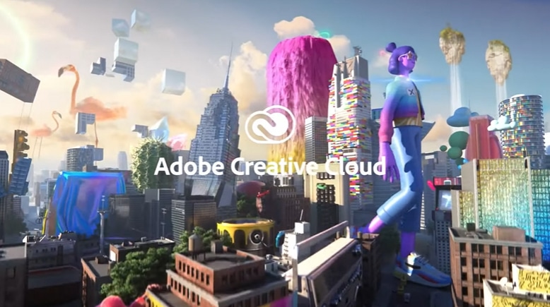
Adobe has a common software problem. A menu full of tools might be technically accurate, but it can often come off as intimidating and fail to communicate what those tools make possible.
The video makes the creative output the main evidence. Images transform, compositions change, and finished work shows what the software can do.
If customers buy the outcome more than the interface, make the outcome the star of the video. This is especially useful for creative software, analytics, and design tools, where the final result matters much more than the process used to create it.
Physical Product Demos and Feature Videos
These examples use close shots, demonstrations, and real use to prove what a physical product can do.
8. Nike: Product Commercial for KD12 Shoes
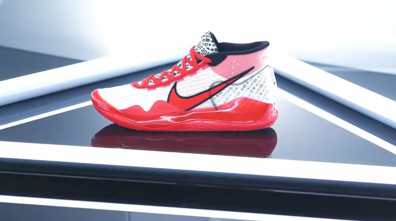
The KD12 video is built around visual identity and product detail. The shoe itself stays at the center of the frame.
To do this, the video highlights design choices and material details, using 360 degree movement, close shots of the shoe, and a strong red palette connected to Kevin Durant’s YouTube identity. The camera spends time on small details because those details are part of what the customer is evaluating.
When subtler elements are influencing the buying decision, wide shots are not enough. Let the camera get close enough to prove what the product page claims.
9. Apple: iPad Air Product Launch Video
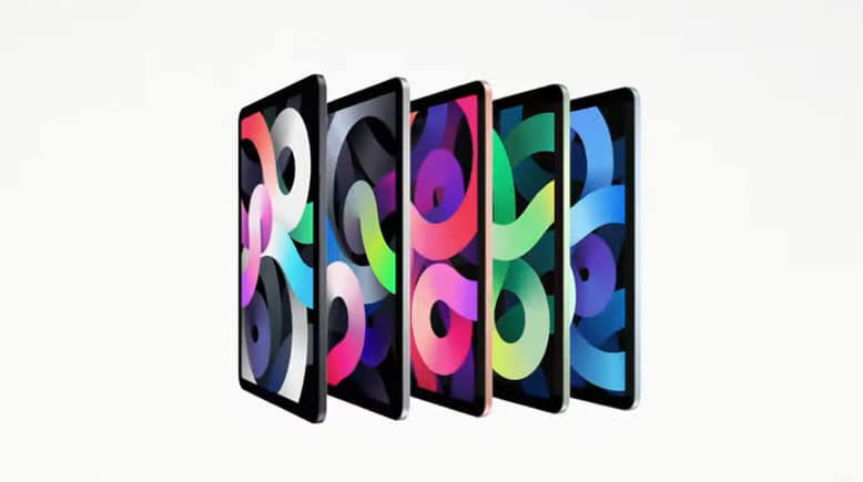
Technical specifications can be important without being interesting on their own. Apple avoids turning the iPad Air video into a spoken spec sheet by making the product itself part of the visual idea.
Text appears directly on the iPad, then the device handles demanding tasks like gaming and creative work. Those demonstrations make the processor claim visible.
Speed, power, ease of use, and flexibility are abstract until the viewer sees the product doing something that requires them. When possible, demonstrate the effect of the specification instead of just naming it.
10. Bulls Bikes US: Product Showcase Video by Yum Yum Videos
With Bulls Bikes US, the product stays at the center even while the script addresses several technical features.
The opening uses a search bar to introduce the qualities a buyer might look for in an electric bike. From there, animated graphics point to specific components while live footage shows the bike in use. The viewer gets both the feature and the physical context.
A product video becomes easier to follow when the opening connects to an existing concern. Search behavior, sales questions, support tickets, and product page FAQs can all reveal what buyers actually want to know first.
11. Victorinox: Swiss Classic Foldable Paring Knife
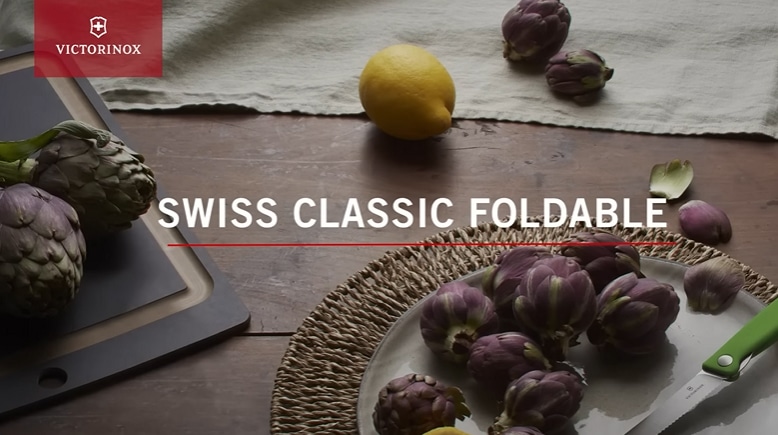
Victorinox shows how little a product video sometimes needs. There’s no narrator explaining every detail or building an elaborate story around the knife.
The camera focuses on the physical mechanism, and on screen text communicates the features. The result works even when the viewer has the sound turned off.
For environments where audio may not be available, like ecommerce pages or trade show displays, the visuals need to carry the core message. Captions and product close shots should support the video rather than rescuing an explanation that only works with sound.
12. Rolex: Platinum Craftsmanship
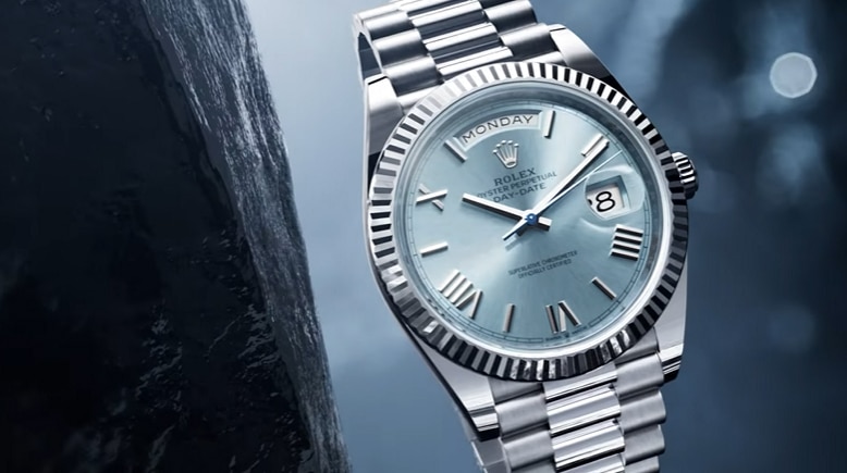
Rolex uses the material itself to make the premium argument. Raw platinum and finished surfaces carry most of the message.
Raw platinum appears alongside finished surfaces, dials, and bezels. Macro footage allows the viewer to feel the craftsmanship and expertise that go into the watches.
Luxury and high value products need visual evidence. Raw materials, textures, and finish can communicate quality more convincingly than adjectives.
13. Nike: Leggings in Motion
Static apparel photography can show color and fit, but it cannot fully show how clothing behaves during movement.
Nike films athletes using the leggings during training, so the product is seen stretching, moving, and staying in place under the conditions it was designed for. The editing is energetic and follows the pace of the activity, reaffirming Nike’s identity as a sports clothing brand.
When buyers care about how a product behaves, film it doing the job. This applies to apparel, but also to tools, outdoor equipment, sports products, appliances, and almost anything where performance changes during use.
14. GoPro: HERO12
GoPro has an advantage that many products do not. They’re in a unique situation where the output of the product can become the advertisement itself.
The HERO12 footage shows what the camera captures in a diverse range of demanding situations that not many cameras could handle. The final footage serves both as evidence and marketing at the same time.
Screenshots, recordings, test results, before and after comparisons, footage, and physical output can all reduce the distance between a marketing claim and what the customer can verify.
15. Marucci: The Development Story
Marucci takes a slower product development cycle and turns it into part of the value proposition. This is a great example of making what might at first seem like weaknesses into strengths.
The spokesperson explains the work behind Marucci’s slower release cycle. Research and development time become part of the quality argument.
Research, iteration, and testing can all be useful materials when the process explains why the final product is better. The trick is connecting the development story to what the buyer actually cares about.
Product Commercials and Lifestyle Videos
Here the product is sold through appetite, identity, atmosphere, or the experience around it.
16. Dunkin: Salted Caramel Sips
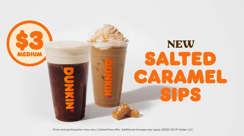
Food videos have a basic limitation: viewers cannot taste anything through the screen. Dunkin works around that by concentrating on texture.
The short video stays close to the details: caramel, ice, pours, and the finished drinks. One product change gets nearly all of the attention, which makes the new flavor feel tangible in a few seconds.
A 15 second product video does not have room for five selling points. For sensory products like food or beauty, one strong visual cue can do more work than a rushed list of features.
17. Dove: 0% Aluminum Deodorant

Dove has two things to introduce. A formula change on the one hand and a refillable format on the other. Trying to give both equal weight would make the short video feel crowded.
Instead, the piece establishes the main product message first, then introduces the refillable deodorant near the end. The secondary product gets enough screen time to create curiosity without taking over the main explanation.
A product video can include more than one item, but the hierarchy has to be clear. The viewer should know which product or benefit the video is really about, letting the secondary product feel like an added bonus.
18. Catan: Animated Gameplay Guide

A board game is physical, but showing a full game in real time would be painfully slow. Setup alone can consume valuable seconds before the viewer understands why the game is interesting.
Catan uses animation to compress all of its many elements into a fast sequence. The video can jump directly to the moments that help someone understand how the game works and what makes it fun.
Products built around steps, systems, or sequences often benefit from explainer video production. They can skip waiting and repetition while preserving the logic the viewer actually needs to understand.
19. JetBlue: JetBlue Mint
JetBlue walks the viewer through the Mint experience. Food, workspace, bedding, and the general feeling of being on board turn the product video into a preview of the service.
For travel and hospitality, the environment can be part of the value. Show what the customer will actually experience, not only what is included.
20. Fenty Skin: Product as Part of a Lifestyle

Fenty Skin frames skincare as part of an active outdoor lifestyle. The setting gives the product line a more energetic identity than a conventional bathroom demonstration would.
Dynamic cinematography and natural light communicate a broader identity around the line. This is a big differentiator in a crowded industry where many competitors can make similar claims about ingredients or results.
Lifestyle footage is useful when the buyer is choosing more than function. The surroundings, movement, and visual language can help define who the product feels made for.
21. Starbucks: Coffee Inside Everyday Life
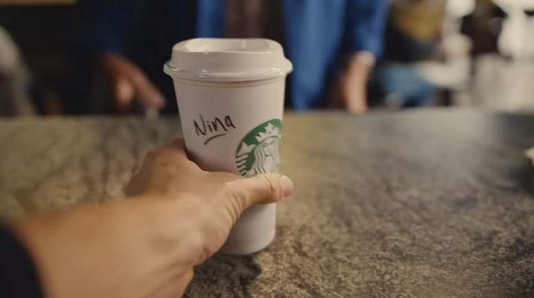
The first time I watched this Starbucks piece, the visual idea took me a moment to decode. That is part of what makes it interesting.
Objects and situations transform into one another as the video moves through work, social moments, and coffee. Starbucks places the drink inside the transitions that make up a normal day.
For products people buy repeatedly, the strongest story may not be about a new feature. It can be about the moment in which the product already fits into the customer’s routine.
22. Lush: Seasonal Product Video
Lush has a natural deadline built into the product because Halloween does not last forever. The limited season becomes part of the reason to show the collection now.
The Halloween theme already creates a clear buying window. Seasonal colors and themed designs show what the products look like while the calendar supplies the urgency.
Technical and Complex Product Explainers
These videos have to simplify difficult information without stripping away the detail the audience needs.
23. Advil: 15 Second Product Commercial
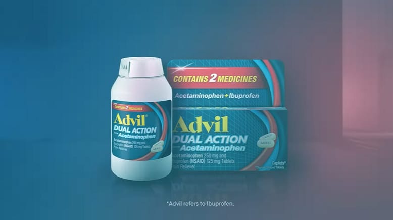
Healthcare products have to communicate with precision, but they often need to do it quickly. Advil uses a short format to name the active compounds, show what they do, and explain the duration of the effect.
The viewer hears the ingredient name while a simpler visual shows what it does in the body. That pairing makes the technical language easier to follow within a 15 second product commercial.
When a product has to speak to both specialists and general consumers, removing every technical term is not always the answer. A visual explanation can make the terminology usable without oversimplifying the product.
24. Thermo Fisher: Technical Product Information Video by Yum Yum Videos
.
Some products become less credible when the explanation is oversimplified. Technical buyers want clarity, but they also want enough detail to know that the company understands the subject.
For Thermo Fisher, the video combines technical visuals with a measured voiceover that explains the equipment and its purpose. Scientists and other specialists need enough detail to evaluate a sophisticated product, so the terminology and pacing match that audience.
25. MedVector: Investor Explainer Video by Yum Yum Videos
MedVector had to solve a communication problem that went beyond product complexity. The same video needed to make sense to investors, doctors, hospitals, employees, vendors, attorneys, the FDA, and pharmaceutical companies.
Yum Yum Videos built the explanation around a patient scenario. The video follows one concrete situation and shows how MedVector fits into it, giving investors, doctors, hospitals, and other stakeholders the same reference point.
MedVector went on to raise $3.5 million in investment. The MedVector case study documents the project in more detail, and its CEO specifically mentioned Yum Yum Videos when talking about that success:
“In fact, we’ve raised $3.5m with a lot of help from our Yum Yum Videos!”

When a product has several buyer groups, adding more explanations can make the message harder to follow. A specific user story can give technical, financial, and operational audiences a shared way to understand what the product actually does.
When Does a Business Need a Product Video?
After looking through the examples, the simplest test is whether the product page is asking text or static images to explain too much.
Typical cases include a technically complex product, an invisible benefit, a physical product buyers need to see in use, or a sale that involves several stakeholders who all need the same explanation.
An experienced animated explainer video company should be able to identify which parts of the message need visual proof and which parts are better left to the page copy. Animation earns its place when it adds information the page cannot show as clearly.

How I’d Plan a Product Marketing Video
A product marketing video starts taking shape before the camera rolls or the first frame is animated. The script, storyboard, production choices, final edit, and distribution plan all affect what the finished piece can do.
I think of the process in four stages: preproduction, production, postproduction, and distribution. The details change depending on whether the project uses animation, live footage, interface recordings, or a mix of formats.
1. Preproduction: Plan the Explanation
The first step is deciding what the audience actually needs to understand. That sounds obvious, but it is where many product videos become overloaded.
- Scriptwriting: Build the script around one central message. As a practical production benchmark, about 80 words of narration usually translates to roughly 30 seconds of video.
- Storyboard: Map the important visual action to the script before production begins. When the script mentions a feature, show that feature on screen at the same moment.
- Format selection: Use live footage when physical use, people, materials, or environments matter. Use animation or interface footage when the value lives in software, data, systems, or invisible processes.
2. Production: Create the Visual Proof
For live footage, production means filming the product, people, locations, and details planned in preproduction. Lighting, lenses, camera movement, styling, and set choices all affect how the product is perceived.
For animation, the team builds the illustrations, interface assets, scenes, and motion that turn the storyboard into the finished sequence. Movement should direct attention to the information the viewer needs to understand.
3. Postproduction: Make the Piece Feel Finished
Editors shape the final footage, adjust timing, correct color, and add visual effects where they support the piece. Sound design, voiceover, music, and motion graphics help control attention and establish pace.
In animation, postproduction may include timing adjustments, transitions, compositing, effects, and final sound. Small changes here can make a technically correct video feel much easier to follow.
4. Distribution: Adapt the Video to Where It Will Live
A product video made for a landing page may not work unchanged as a vertical social ad. Before publishing, decide where the full piece belongs and which shorter versions are worth creating.
For search visibility, use descriptive video titles, useful page copy, transcripts where appropriate, and structured data when the page supports it. For social channels, cut the opening aggressively enough that the product or problem appears before the viewer scrolls away.
Frequently Asked Questions
What Is the Ideal Length for a Product Video?
Runtime depends on the job. A social ad may only need 15 or 30 seconds, while a product demo or technical explainer may need 60 to 90 seconds or more.
For many landing page videos, 60 to 90 seconds is a useful starting point because it gives the product enough time to establish the problem, explain the core value, and show how it works. If the buyer needs more context, a longer video can be the better choice.
How Much Does Custom Product Video Production Cost?
The answer depends heavily on format, complexity, runtime, and production level.
In July 2026, Yum Yum Videos collected 61 valid professional quotes and found a median price of $9,680 per minute. You can see the methodology and full pricing tiers in the animation cost study.
Live footage can vary even more because locations, actors, equipment, crew size, travel, and shooting days affect the budget.
Where Should I Publish a Product Marketing Video?
Start with the page where the viewer is closest to evaluating the product. Some examples could be a product page, landing page, SaaS feature page, ecommerce listing, or demo page.
From there, adapt shorter cuts for YouTube, social media, paid campaigns, sales outreach, email, and presentations. Use the master video as source material for the versions each channel needs.
What Makes a Good Product Video?
A good product video leaves the viewer with a clearer idea of what the product does and how it fits their situation. Strong visuals, storytelling, humor, production quality, and animation support that explanation when they make the product easier to follow.
What Is the Difference Between a Product Video, a Product Demo, and an Explainer Video?
A product video is the broad category. It can introduce the product, demonstrate it, tell a story around it, or focus on a specific benefit.
A product demo usually spends more time showing the product itself in use. For software, that often means interface recordings or guided workflows.
An explainer video focuses on helping the audience understand an idea, process, product, or service. The three formats can overlap, especially with software and technical products.
Which Product Video Style Should I Use?
Choose the style based on what is difficult to communicate.
If the buyer needs to judge materials, movement, people, or physical use, live footage usually gives the strongest proof. If the value happens inside software, data, finance, healthcare systems, or another invisible process, animation and interface footage can make the explanation concrete.
For products that need both, mixed media can combine real footage with motion graphics, labels, interface elements, or animation.
Choosing the Right Product Video Approach
The 25 examples solve very different problems through video.
Amazon Coins needed a visual way to explain something intangible. Nike needed to prove materials and movement. Slack needed the viewer to understand an interface. Rolex used raw material and close photography to communicate value. MedVector needed one story that could make sense to several very different audiences.
Before planning your own product video, ask the sales team which question prospects still ask after reading the page or seeing the demo. Build the video around that information gap.

Victor Blasco
Co-founder of Yum Yum Videos | Explainer Video & Video Marketing Expert
Victor Blasco has over 25 years of experience in animation and film production. For the past 14+ years, he has worked with companies to create explainer and marketing videos that simplify complex ideas and drive business results.
His work has supported global brands like Amazon and McKesson, as well as startups that raised over $2B and reached unicorn or IPO stages.
Victor shares insights based on real client work. His contributions have been published on platforms like Social Media Examiner, and he has been featured or quoted in outlets such as Forbes.