Top 20 Effective SaaS Explainer Videos to Get Inspired By!

Co-founder of Yum Yum Videos | Explainer Video & Video Marketing Expert
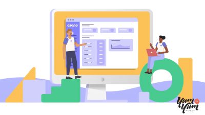
A SaaS product can do a lot behind one screen. It may automate billing, connect teams, analyze data, or replace a process that used to take hours. Much of that value stays invisible until someone understands where the software fits into their day.
A good SaaS explainer video gives that value some context. It can show the problem first, bring the product in at the right moment, and help the viewer understand why it matters without walking through every feature.
These 20 SaaS explainer video examples use very different visual approaches, from product screens to character animation and motion graphics. Several are projects we produced at Yum Yum Videos, an animated explainer video company, so for those I can also explain what we were trying to solve from the production side.
I have worked on explainer and marketing videos for more than 14 years, and one lesson keeps coming back with SaaS: the software may be complex, but the video still needs one clear job. Once that job is defined, the format becomes much easier to choose.
Table of Contents
What Is a SaaS Explainer Video?
A SaaS explainer video is a short video that explains what a software product does, who it is for, and why someone would use it.
The format can be fully animated, based on product screens, built around a character, or combine several visual styles. The choice depends on what the viewer needs to understand. A new category may need more context and storytelling. A familiar tool with an unfamiliar feature may need a direct product demonstration.
This is also where SaaS explainer videos and product demo videos begin to separate. An explainer focuses on the value and the problem the software solves. A demo spends more time showing how the product works inside the interface.
For many SaaS companies, the most useful video sits somewhere between the two.
20 Best SaaS Explainer Video Examples
1. Boscloner: Use Humor to Open a Technical Topic
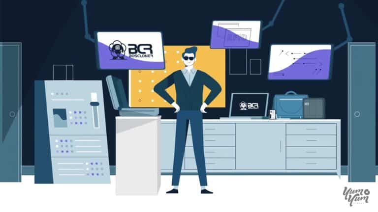
Boscloner deals with software security, a subject that can become technical very quickly.
The video opens with humor before moving into the product. That gives the audience an easy entry point and creates a tone that feels less formal than the category usually does.
What works here is the order. The joke earns attention first, and the product explanation follows once the viewer understands the problem.
Humor will not fit every SaaS brand, but it can work when the subject is dry and the personality of the company already supports it.
2. Cisco: Organize Several Benefits Around One Idea
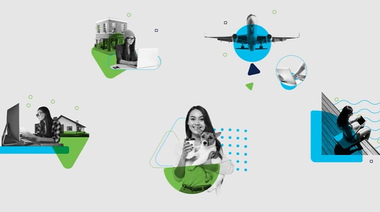
Cisco has more than one feature to explain, so the challenge is keeping the video from feeling like a checklist.
The mixed visual approach helps group different benefits under the larger idea of secure remote work. Product information, photography, and motion graphics all contribute to the same message.
The lesson is useful for larger SaaS platforms. When several features need screen time, the viewer still needs one reason to care about all of them.
3. Hotjar: Let the Product Look Like the Brand
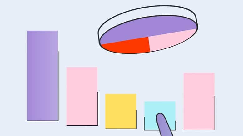
Hotjar uses its own interface, color palette, shapes, and illustration style throughout the video.
Software can look generic when it is reduced to screens and icons. Hotjar avoids that by carrying its visual identity through the interface, shapes, colors, and illustration.
For a SaaS explainer video, branding can be part of the explanation. The viewer learns how the product feels while learning what it does.
4. Sprinto: Give the Problem to a Character
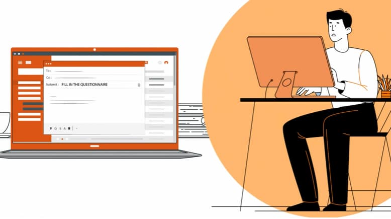
Sprinto uses an animated character to represent the person dealing with the problem.
That gives abstract business issues a human reference point. Instead of describing the audience in general terms, the video lets the viewer watch one person deal with the situation.
Characters are especially useful when the software solves a problem that is familiar emotionally but complicated operationally. The audience can recognize the frustration first and understand the process second.
5. Webflow: Sell the Vision Before the Workflow

Webflow does not begin with a detailed product walkthrough. It starts with the larger idea behind the product: building for the web without being limited by code.
The visuals and music support that philosophy, so the video feels closer to a brand statement than a traditional software demo.
This works because Webflow is selling more than a set of features. It is selling a different way to build.
For SaaS brands creating a new category or challenging an established workflow, the vision may deserve more screen time than the interface.
6. Wix: Mix Product Screens With Motion Graphics
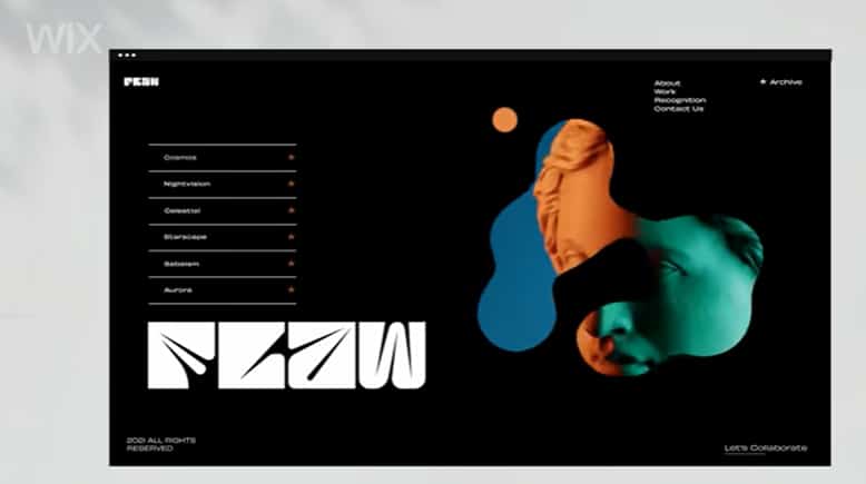
Wix combines screencast style footage, motion graphics, and kinetic typography.
Each visual technique has a specific job. Product screens show the software. Motion graphics help transition between ideas. Text reinforces the points that need to land quickly.
The result is useful for SaaS products with a broad feature set because the video can move between interface detail and higher level benefits without feeling stuck inside a screen recording.
7. Autodesk Insight: Speak to the Audience at Their Level
Autodesk Insight is aimed at architects and building professionals, so the video can use terminology and visuals that would be too specific for a general audience.
That specificity is a strength. The viewer sees real architectural information and hears language that belongs to the work they already do.
A SaaS explainer does not always need to simplify every term. Sometimes clarity comes from speaking accurately to an audience that already knows the category.
8. Pandium: Put the Product Inside a Story
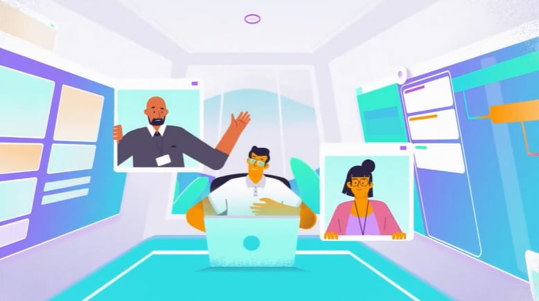
Pandium starts with a character and a problem before moving deeper into the software.
The story gives the product a reason to appear. Viewers first understand what the character is trying to solve, then see how the software changes the situation.
Pandium also mixes that narrative with concrete information, which keeps the video from becoming purely emotional.
For B2B SaaS, that balance works well: the story creates context, and the product details make the explanation concrete.
9. TripAdvisor: Keep a New Feature Easy to Follow

TripAdvisor introduces an advertising product to an audience that may not think of the platform as an advertising tool.
The video uses interface animation to make the new service feel familiar. Viewers can see where the feature lives and what they would do with it.
That is often the right approach when a known brand launches something new. The video does not need to explain the company again. It needs to reduce the distance between the audience and the new feature.
10. Adobe Photoshop: Let the Product Output Do the Talking
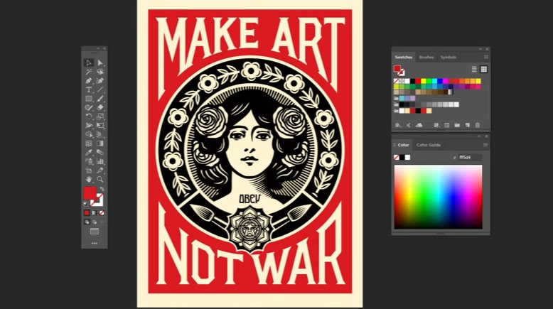
Adobe takes a more visual route.
The video uses work created with Photoshop to demonstrate what the software makes possible. The product becomes visible through the work people create, so Adobe can avoid a long interface walkthrough.
This approach works well when the result is easier to appreciate than the process.
For creative SaaS products, showing what people can make may say more than explaining each tool individually.
11. Dropbox: Build the Story Around What Users Keep
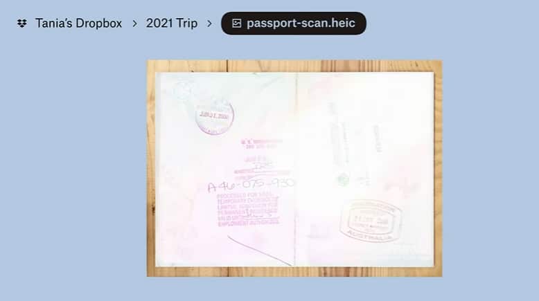
Dropbox uses personal photos and files to connect the software with the lives behind each account.
The storage product stays simple. The meaning comes from the things people choose to save.
That is a smart storytelling choice because cloud storage is functional by nature. The video gives the service emotional context without changing what the product actually does.
12. Xero: Use a Partnership to Explain the Product

Xero connects business numbers with the growth of women’s football.
The partnership gives the video a second layer. Viewers see a familiar story about progress while Xero demonstrates how its software helps people understand growth through numbers.
A brand partnership works best when both sides contribute to the same idea. Here, the connection is measurement, progress, and performance.
13. Google Assistant: Show the Software in Everyday Life
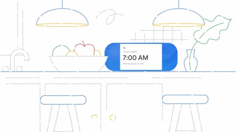
Google Assistant follows one person through different parts of the day.
The software appears when it is useful, so each feature has a real situation around it. Music, reminders, information, and other functions enter naturally as the day progresses.
The viewer never has to imagine the use case because the video shows the software appearing inside ordinary moments of the day.
14. DocuSign: Use the Interface When Ease of Use Is the Selling Point
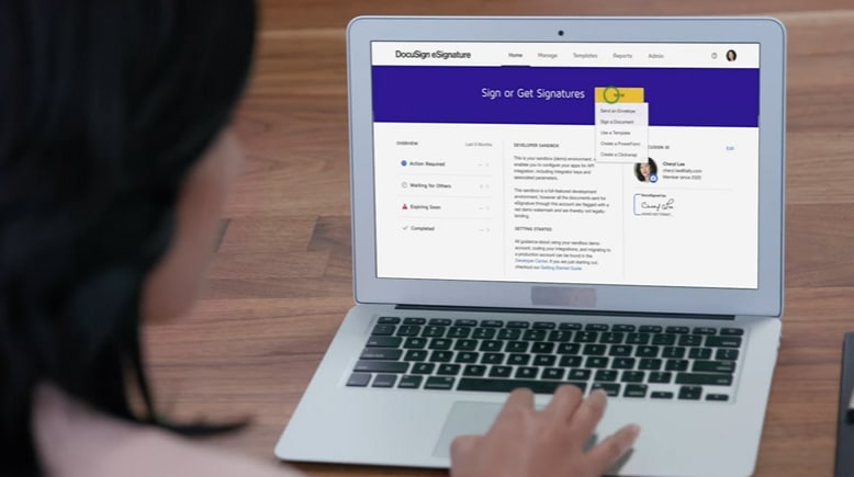
DocuSign benefits from showing the product directly.
Signing a document is already familiar, so the important question is how much easier the digital version makes the task. Screen based footage answers that quickly.
For SaaS products where usability is a major selling point, a product video example with real interface footage can be more useful than a fully abstract animation.
15. Shopify: Speak to More Than One User Group
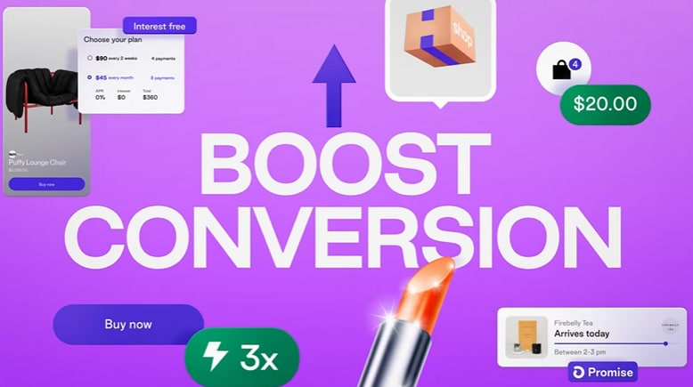
Shopify serves merchants and shoppers, so the video has to account for more than one perspective.
The structure separates those audiences visually. Mobile scenes focus on the shopping experience, while desktop screens move toward merchant tools and analytics.
That makes the segmentation easy to follow.
If a SaaS product serves several audiences, one video can still work as long as each group has a clear place in the structure.
16. Microsoft Loop: Turn the Interface Into Motion
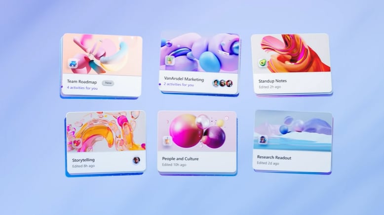
Microsoft Loop uses motion graphics to make the software feel active beyond the screen.
Interface elements move through the composition and connect with objects in the physical environment. The visual idea helps communicate collaboration and movement without a long verbal explanation.
This is one reason motion graphics work well for SaaS. Abstract actions such as sharing, syncing, updating, and collaborating can become visible.
17. Accelerant by Yum Yum Videos: Give a Complex Platform Enough Time
Accelerant is a data driven insurance platform with several audiences and a business model that cannot be explained in one sentence.
Between 2021 and 2024, our team produced nine explainer videos for Accelerant. Some introduced the company, while others focused on investors, members, and specific industry problems.
One of the Accelerant videos needed close to three minutes because the audience required more context before the value proposition made sense. In that case, shortening the video would have meant removing information the viewer actually needed.
During the collaboration period, Accelerant raised $190 million in 2022 and another $150 million in 2023. In 2025, the company went public on the NYSE, raising $724 million at a $6.4 billion valuation.
Those milestones belong to Accelerant. Our role was to build communication assets around a complex platform as the company expanded. The Accelerant case study covers the nine videos and the different audiences they were built for.
18. Chargebee by Yum Yum Videos: Turn an Abstract Workflow Into Something Visible
Subscription billing can become complicated fast. Revenue recognition, recurring payments, taxes, and billing logic all happen behind the scenes.
We produced three animated explainer videos for Chargebee in 2020. One creative decision was to make common expressions such as leaks and tangled billing logic literal on screen, giving the audience a visual way to understand an abstract problem.
One of the core explainer videos passed 265,000 views on YouTube.
During the broader period around our collaboration, Chargebee raised $55 million in 2020, followed by $125 million in 2021, when it reached a $1.4 billion valuation. In 2022, the company later raised another $250 million at a $3.5 billion valuation.
Again, the company earned those business milestones. The videos were communication assets used as Chargebee explained subscription billing to customers, partners, and other stakeholders. The full Chargebee case study has the timeline.
19. Airtm by Yum Yum Videos: Start With the Audience’s Reality
Airtm needed to explain a financial product to people dealing with currency instability and limited access to international financial services.
We opened the video from that reality. The voiceover addresses the audience directly, while the animation gives the economic problem a visual form before moving into the product.
The same approach can work outside fintech. When the audience already knows the problem well, the opening can acknowledge it quickly and spend more time on what changes with the product.
20. Loadsmart by Yum Yum Videos: Build a System Across Several Products
Loadsmart is a good example of what happens when one SaaS explainer video becomes a series.
Between 2022 and 2024, we produced five animated explainers for products including Kamion, Opendock, ShipperGuide, and Managed Transportation.
Each product needed its own message, but the videos also had to feel like parts of the same platform. That meant keeping a consistent visual language while changing the story and level of product detail from one video to the next.
The core product explainers reached nearly 3 million combined views. Opendock and Managed Transportation each passed 1.2 million views.
Those view counts are direct video results. Loadsmart’s business growth is separate. The Loadsmart case study shows how the five videos were used across product launches, the website, and industry events.
What Makes a Good SaaS Explainer Video?
After working on SaaS projects across very different categories, I keep coming back to a few decisions that shape whether the video works.
Give the Video One Main Job
A SaaS video may need to introduce the company, explain a product, or support a launch. Problems start when the script tries to cover every possible job at once.
Write the primary job in one sentence before production starts. That sentence should guide what stays and what gets removed.
Start Where the Audience Is
The viewer may already understand the problem, or they may not know the category exists.
Airtm can begin with currency instability because its audience recognizes the situation. A new technical category may need more setup.
The first 15 seconds should reflect what the audience already knows.
Decide How Much Product to Show
Some SaaS explainer videos work best with characters and visual metaphors. Others need the actual interface.
If the selling point is usability, show the product. If the challenge is explaining a new idea, give the audience context first.
For deeper interface examples, our guide to product demo video examples shows how companies handle walkthroughs, screen recordings, and product focused animation.
Write the Script Before Designing the Video
The visuals should support the message, so the explainer video script needs to work before animation begins.
Read the script without looking at a storyboard. If the product still sounds confusing, design will not solve the underlying problem.
This is also the cheapest point in production to make a major change.
Use Brand Elements With a Purpose
A SaaS video becomes more recognizable when the product’s own visual language carries into the animation.
Hotjar is a good example. Its product and its visual identity feel connected.
Branding should help the viewer recognize the company without competing with the explanation.
How Long Should a SaaS Explainer Video Be?
Many SaaS explainers fit comfortably between 60 and 120 seconds, but the right length depends on the communication problem.
A simple feature launch may need less than a minute. A new B2B category or technical platform may need more time. Accelerant is a good example of a project where the explanation justified a longer runtime.
I would not choose the length first. Start with the message, write the script, and remove anything that does not help the viewer understand the product or take the next step.
How Much Does a SaaS Explainer Video Cost?
Pricing changes with the amount of custom production the project requires and how quickly it needs to be delivered.
In our 2026 animation pricing study, we contacted 125 animation companies and collected 61 usable quotes. The median quote was $9,680 per minute.
Professional custom animation can move above or below that number depending on the project. More complex animation and tighter deadlines usually add production work.
The full animation cost study explains the methodology and pricing ranges in more detail.
For SaaS, I would compare more than the final number. Check what the quote includes for script development, storyboard, design, revisions, voiceover, sound, and product changes during production.
SaaS Explainer Video vs. Product Demo Video
The two formats overlap, but they usually answer different questions.
A SaaS explainer video answers: Why should I care about this product?
A product demo answers: How does this product work?
The explainer may spend more time on the audience problem, value proposition, and use case. The demo usually spends more time inside the product.
Many SaaS companies need both. The explainer earns interest, while the demo helps a prospect evaluate the software in more detail.
SaaS Explainer Video FAQ
What is the best style for a SaaS explainer video?
There is no single best style. Motion graphics work well for interfaces, systems, and data. Character animation can make a workflow more human. Product screens are useful when usability is part of the value proposition.
The style should follow the message.
Should a SaaS explainer video show the actual product?
Show the interface when seeing the product helps the viewer understand why it is useful.
When the software solves a workflow that is not obvious at first glance, start with the problem and introduce the interface later. A hybrid approach can also work well.
How many features should a SaaS explainer video include?
Include the features that support the main message.
A 90 second video rarely needs the entire feature set. Choose the functions that explain the central use case or give the audience a reason to continue exploring the product.
Can SaaS explainer videos work for enterprise products?
Yes. Enterprise SaaS often benefits from explanation because the buyer may need to understand a workflow, integration, or business model before evaluating specific features.
Accelerant, Chargebee, and Loadsmart all required different levels of context because their audiences and products were complex.
Where should a SaaS explainer video be used?
Common placements include the homepage, product pages, sales presentations, product launches, paid campaigns, onboarding, and industry events.
The placement should influence the script. Someone watching on a product page already has more context than someone seeing a paid ad for the first time.
Before You Approve the Script
Before approving the script, read it once without the storyboard and answer these five questions:
- Who is the video for?
- What problem does that person recognize?
- What changes when the software appears?
- Which product details are necessary to prove the point?
- What should the viewer do next?
If the answers are clear, the visual style has something solid to build on. If they are not, keep working on the script before production moves forward.

Victor Blasco
Co-founder of Yum Yum Videos | Explainer Video & Video Marketing Expert
Victor Blasco has over 25 years of experience in animation and film production. For the past 14+ years, he has worked with companies to create explainer and marketing videos that simplify complex ideas and drive business results.
His work has supported global brands like Amazon and McKesson, as well as startups that raised over $2B and reached unicorn or IPO stages.
Victor shares insights based on real client work. His contributions have been published on platforms like Social Media Examiner, and he has been featured or quoted in outlets such as Forbes.