15+ Best Animated Marketing Video Examples for 2026 (Real ROI & Results)

Co-founder of Yum Yum Videos | Explainer Video & Video Marketing Expert
Animated marketing videos let marketers show things a camera cannot capture directly. An API request moving through a system, a palm payment being authorized, or the mechanism inside a product can all be turned into something the viewer can follow on screen.
At Yum Yum Videos, our own projects use different formats for different problems. Workflows often become motion graphics or UI animation. Human stories use characters. Hardware often moves toward 3D when the viewer needs to inspect parts, materials, or internal components.
I included projects we produced ourselves because we know the production decisions behind them. The outside campaigns are here for specific reasons: Slack turns workplace disorder into motion, Amazon One teaches a new payment behavior, and Razer uses 3D to expose product details that would be difficult to film.
What Is an Animated Marketing Video?
Animated marketing videos use animation to promote or explain a product, service, company, or idea.
A homepage explainer may walk through a workflow. A paid social spot may introduce one feature. A brand film may focus on the idea behind the company and barely show the interface at all. The same medium serves very different marketing jobs.
The term overlaps with animated promotional videos, animated explainer videos, product videos, and animated commercials. The label changes with the video’s purpose.
For example, an animated product overview may spend most of its time showing features and workflows. A 30 second animated promo may focus on one benefit. A brand film can spend nearly all of its runtime creating a feeling or association.
18 Animated Marketing Video Examples Worth Studying
Best Animated Marketing Videos (2026)
1. Accelerant
Accelerant operates in insurtech, where the product is a network and data driven insurance platform rather than something a viewer can simply watch in action.
We produced nine videos for the company between 2021 and 2024. Different pieces were used to explain underwriting, the member network, shared risk, and other parts of the business to brokers, partners, and investors.
The nine-video series separated the message by audience. Brokers could focus on underwriting, partners on the member network, and investors on the mechanics of shared risk. No single video had to carry the entire company story.
During the years we worked together, Accelerant raised more than $340 million in private funding. In 2025, the company raised $724 million in its NYSE IPO at a valuation of about $6.4 billion. Those are company milestones, not results we attribute to the videos. They do show the stage of growth in which the content was being used.
Accelerant is a good example of when one explainer is not enough. Different audiences needed different parts of the story, so the content was split across nine pieces instead of compressing everything into one script.
2. Chargebee
.
Subscription billing involves recurring revenue, pricing changes, failed payments, taxes, and other workflows that multiply as a SaaS company grows.
We created three animated videos for Chargebee. The scripts focused on recognizable business problems and used animation to make the workflows visible without turning the videos into software tutorials.
We split the story instead of packing the full platform into one piece. Each video could concentrate on a smaller set of workflows, giving buyers enough context to understand the problem before moving into product detail.
Chargebee later reached unicorn status at a $1.4 billion valuation and was valued at $3.5 billion after a 2022 funding round. As with the Accelerant example, those milestones belong to the company. The videos were communication assets used during a period of rapid expansion.
3. BrightInsight
.
Digital health platforms have an additional challenge: the marketing has to explain technology without making a regulated product sound casual or oversimplified.
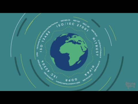
We produced two videos for BrightInsight around its digital health platform. The visual approach used controlled motion, clean diagrams, and a restrained design system to explain workflows, interoperability, and the relationship between different parts of the platform.
The animation organizes information that would otherwise sit in architecture diagrams, product decks, or dense paragraphs.
BrightInsight announced a $101 million Series C, and the company later reported strong revenue growth during its expansion. In the video itself, the restrained motion and clean diagrams fit a regulated health product better than a louder visual treatment would.
4. Slack: Communication Without Chaos
Slack’s “Communication Without Chaos” does not rely on a detailed UI walkthrough. It turns the feeling of workplace disorder into shapes, movement, rhythm, and color.
That choice fits the problem. “Too many messages in too many places” is partly functional and partly emotional. The animation gives the audience a visual version of that frustration, then reorganizes it.
Slack demonstrates the experience of the product without showing every screen. The motion itself communicates the shift from disorder to organization.
5. Amazon One
Amazon One had to explain a behavior that was unfamiliar when the product launched: paying or entering a venue with the palm of your hand.
The video uses simple 2D animation and everyday situations such as stores and checkout points. The viewer sees where the technology fits into a normal routine before getting buried in technical detail.
Amazon One first shows the behavior: approach the terminal, scan the palm, complete the transaction. The viewer understands the basic action before the video gets deeper into the technology.
Animation also lets Amazon control how much technical information appears at each step, which keeps an unfamiliar payment method easy to follow.
6. Starbucks: Why Does Starbucks Blend Coffee?
Coffee is easy to film. The reasoning behind a blend is harder to show.
Starbucks uses animation to explain how beans with different flavor notes can work together and why the company creates particular combinations. The visuals stay simple enough that the viewer can follow the idea while listening to the narration.
The animation shows the part of the product story customers normally miss: why different beans are blended and how flavor notes work together.
The same approach works for ingredients, manufacturing, sourcing, or internal processes. The product may be familiar while the reasoning behind it is not.
7. monday.com: Work Without Limits
monday.com’s video moves quickly because speed is part of the product promise.
The editing, UI elements, typography, and transitions give the viewer a sense of constant movement. A slower video could explain the same features, but it would communicate a different feeling.
The pacing carries part of the message. A productivity platform that promises speed should not feel slow on screen.
For animated marketing videos for business, the timing should match the product. A productivity tool can feel fast. A healthcare platform may need more breathing room. An educational video may need enough time for a concept to land before the next one appears.
8. McGraw Hill
We created three videos for McGraw Hill covering GO, Sharpen, and Evergreen.
The audience included instructors and students, so the videos had to explain digital learning products without assuming that every viewer was equally familiar with the platforms. We used animation to show workflows, product benefits, and the role each platform played in the learning experience.
The videos were placed on official product pages, which is an important distinction. You can see more project context in our McGraw Hill case study. This was not animation created only for awareness. It had to help people understand the products at a point where they were already evaluating them.
McGraw Hill later reported continued digital growth, and Evergreen reached very high instructor adoption. Those business results have many causes. From a video standpoint, the case shows why product page animation needs to answer practical questions, not just look polished.
9. Branch
.
Branch works with mobile linking and attribution, two concepts that become complicated quickly when described only with words.
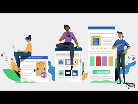
We created an animated explainer that turned user journeys and data flows into paths a viewer could follow. The product lives behind the scenes, so the animation gave that infrastructure a visible form.
Branch later raised a $300 million Series F at a $4 billion valuation. Again, the funding is company context rather than a claimed video result.
When the buyer cannot see the product working, the animation can follow the movement of information, users, or decisions instead.
10. Ahrefs: Animated Product Overview
Ahrefs has a large set of SEO tools, which creates a familiar software marketing problem. Showing the complete interface can make a short video feel like training material.
Its animated overview uses character motion, UI inspired visuals, and simplified examples to show why someone would use the platform before diving into individual features.
The video starts from a problem marketers recognize and then introduces the product as part of the solution.
That structure works well for marketing video animation because it gives viewers a reason to care about the interface before asking them to follow it.
11. McDonald’s Japan: Anime Commercial Series
McDonald’s Japan has used anime influenced advertising that feels designed for the local market rather than adapted from a generic global campaign.
The characters, pacing, everyday situations, and product moments fit naturally into the visual language of the spots. The animation style is part of the localization.
The same principle applies outside food marketing. Animation can be adapted by region without reshooting locations or recasting live action scenes, but visual localization takes more than translating the voiceover.
A cartoon marketing video works best when the character design, humor, timing, and references make sense for the people who will actually watch it.
12. Airbnb: Isometric 3D Campaign
Airbnb has used short isometric 3D spots that turn homes into small visual worlds.
The format is a smart fit for a platform built around variety. One visual system can accommodate cabins, apartments, beach houses, and other types of stays while keeping the campaign recognizable.
The short camera moves also make the spaces feel explorable without requiring a full property tour.
For animated promotional videos with many product variations, a modular visual system can save the campaign from looking like a collection of unrelated assets.
13. Razer Naga
Razer’s Naga promo uses 3D animation to make the mouse feel mechanical, fast, and highly engineered.
Close ups reveal buttons, materials, surfaces, and movement in ways that would be difficult to capture with standard product footage alone. Lighting and sound give the product weight even though the piece is fully animated.
The video does not need a narrator. The object is the story.
For hardware, 3D animation is useful when the viewer needs to inspect details, see internal components, or experience a product from angles that a normal camera setup would struggle to achieve.
14. Dropbox: The World Needs Your Creative Energy
Dropbox used textured 2D animation to move the brand conversation away from simple file storage and toward creativity and collaboration.
The campaign does not behave like a feature demo. It creates a visual world associated with making things, sharing ideas, and creative work.
Dropbox uses the art direction to change the conversation around the brand. The product interface stays in the background while the campaign pushes creativity and collaboration to the front.
When a brand needs a new association, the art direction can carry part of that shift.
15. Microsoft: Re-imagining Mobile Experiences
Microsoft’s 3D animated campaign turns digital clutter into physical scenes.
Tasks, apps, and workflow problems become objects and spaces that can be reorganized on screen. The viewer experiences the before and after as movement rather than as a sequence of UI screenshots.
Microsoft turns a software benefit into a physical metaphor: clutter becomes objects and spaces that can be reorganized on screen.
The product still needs to be understood, but the animation can start with the experience. For some campaigns, that is more memorable than showing another dashboard.
16. Logitech and RingCentral
This video combines illustrated environments with realistic product renders.
That hybrid approach solves a practical problem. The story needs people and situations, while the hardware needs to look accurate. Pure cartoon animation could make the devices too abstract, and a conventional live action demo could become rigid.
Mixed media lets the video move between both needs.
For companies selling hardware and software together, this format can show the physical product, the interface, and the user’s context in the same visual system.
17. Android: Rock, Paper, Scissors
Android’s “Rock, Paper, Scissors” turns the familiar game into a story about characters who are expected to oppose one another but choose to help instead.
There is no product walkthrough and very little need for explanation. Character animation, music, and the visual metaphor carry the brand message.
This is brand marketing rather than product education.
Android moves almost completely away from product features, but the story still connects directly to the brand line, “Be together. Not the same.”
18. Porsche: Evolution of the 911
The Porsche animation uses the changing silhouette of the 911 to tell a design story across generations.
For a car brand, live action footage would be the obvious choice. Animation offers a different advantage here: it can isolate form, proportion, and evolution without distractions from location, weather, or driving footage.
The result feels closer to a moving design study than a traditional car commercial.
For Porsche, animation isolates the design changes from one generation to the next. The viewer can compare shape and proportion without the distractions of location or driving footage.
Where Animated Marketing Videos Work Best
The examples above do very different jobs. Still, a few situations come up repeatedly when companies choose animated videos for marketing.
SaaS and B2B Products
Software often needs to explain systems, integrations, data flows, or workflows that are difficult to communicate with a screen recording alone.
For SaaS and B2B products, one video can combine UI, diagrams, characters, and abstract visuals. That mix works well for product overviews, landing pages, sales presentations, and investor communication.
Animated Promotional Videos
A promotional video usually has a narrower job than a full explainer. It may introduce a new product, support a launch, promote a feature, or create interest around a campaign.
Animation works well here because the visual idea can be built around one benefit rather than a complete product explanation.
Consumer and Brand Campaigns
Red Bull, Android, Dropbox, Airbnb, McDonald’s, and Porsche show how far marketing animation can move beyond software.
Characters, visual systems, 3D worlds, and stylized motion can become part of a brand’s identity. In these cases, memorability may matter more than explaining a workflow.
Education and Product Adoption
Animation also has a role later in the customer journey.
Product page videos, onboarding content, tutorials, training material, and educational pieces can use the same visual system while going deeper into how something works.
Animated Marketing Video vs. Animated Promotional Video
The two terms overlap, but the emphasis can be different.
An animated marketing video is the broader category. It can support awareness, product education, sales, onboarding, brand positioning, or a campaign.
An animated promotional video usually focuses more directly on generating interest in a product, offer, launch, event, or feature. It is often shorter and narrower.
Use animated marketing video as the broader term. A 90 second SaaS explainer on a homepage fits inside that category. A 20 second social spot built around one new feature is usually an animated promo. The animation techniques can be identical even when the job is different.
Cartoon Marketing Videos vs. Motion Graphics
“Cartoon marketing videos” usually refers to animation built around illustrated characters and scenes. They work well when the story benefits from people, humor, emotion, or a recognizable brand world.
Motion graphics rely more on typography, shapes, icons, diagrams, data, and abstract movement. They are often a better fit for SaaS, finance, technology, and corporate topics where the viewer needs to understand a process or system.
Many projects combine both.
Many real projects mix styles. A character scene can lead into motion graphics and then into the product UI without needing to choose a single label for the whole video.
How We Approach Animated Marketing Video Production
At Yum Yum Videos, the production process starts before anyone animates a frame.
1. Define the Viewer and the Job
A video for a first time website visitor needs different information from a video used in a sales meeting.
We decide who is watching, what they already know, and what they should understand or do after the video.
2. Write the Script Around One Main Idea
Feature lists are easy to write and hard to watch.
The script needs one main idea. In a product video, we often build around a problem the buyer recognizes and the point where the product solves it. A campaign may be driven by a joke or product benefit. A technical service may need a sequence that shows how information moves through a system.
3. Build the Visual Logic
The storyboard decides what the viewer sees while each line is being spoken.
This is where animation earns its place. An API call can become a moving object. A rule can become a gate. A workflow can become a path. The visual should add information rather than decorate the narration.
4. Animate, Add Sound, and Review
Movement controls attention. Sound gives actions weight and helps transitions feel intentional.
The final stages also reveal problems that were less obvious on paper. A section may be too fast, a visual may compete with the voiceover, or an idea may need more screen time.
Choosing an Animation Style for Marketing
The best style depends on what the video needs to show.
2D character animation works well for stories involving people, customers, employees, or situations the audience should recognize.
Motion graphics are useful for SaaS, fintech, data, processes, corporate communication, and abstract systems.
UI animation is useful when the interface itself is central to the value of the product.
3D animation works well for hardware, industrial products, physical mechanisms, premium product launches, and objects that need to be viewed from multiple angles.
Mixed media can combine animation with live action, photography, UI, product renders, or existing footage.
A style should solve the communication problem first. Visual taste comes after that decision.
Frequently Asked Questions About Animated Marketing Videos
What is an animated marketing video?
An animated marketing video uses animation to promote or explain a product, service, brand, or idea. Common formats include animated explainers, product overviews, promotional videos, commercials, social ads, and brand films.
How much do animated marketing videos cost?
Pricing varies by length, style, complexity, and production team.
For professional custom animation, a 60 to 90 second project can range from several thousand dollars to well above $20,000. Our animation cost guide breaks down pricing by production tier and style. More complex 3D work can cost significantly more.
At Yum Yum Videos, custom projects are priced according to the scope, style, length, and production requirements rather than a single flat rate.
How long does an animated marketing video take to produce?
A custom animated marketing video commonly takes several weeks because the work includes script development, storyboard, design, animation, voiceover, sound, and revisions.
For our projects, a typical schedule is around 6 to 8 weeks, depending on scope. Rush schedules can be shorter when the project allows it.
What is the best length for an animated marketing video?
Many marketing videos fall between 60 and 120 seconds, but the right length depends on where the video will live and what it needs to explain.
Short ads may work in 15 to 30 seconds. A homepage explainer may need around 60 to 90 seconds. Technical, educational, or regulated topics can require more time.
The script should determine the runtime, not the other way around.
Are animated marketing videos good for business?
They can be a good fit when the product is difficult to film, the service is abstract, the workflow has several steps, or the brand needs a controlled visual style.
They are less useful when real people, physical proof, customer testimony, or a real location is the main reason the audience should believe the message. In those cases, live action may be the better choice.
Are animated promotional videos the same as animated marketing videos?
Animated promotional videos are one type of animated marketing video. Promotional pieces usually focus on a specific product, launch, feature, offer, or campaign, while marketing videos can also cover education, sales, onboarding, and brand communication.
What type of animation is best for marketing?
There is no universal best style.
2D character animation is useful for human stories. Motion graphics work well for systems and abstract topics. UI animation helps explain software. 3D is useful for physical products and internal mechanisms. Mixed media works when the story needs more than one visual source.
How to Apply These Ideas to Your Own Video
Start with the part of the product that is hardest to communicate.
If it is a workflow, map the steps. If it is a physical detail, show the mechanism. If it is a brand idea, build the video around a story or visual system that can carry that idea without a long explanation.
The examples above make the pattern easy to see. Accelerant and Branch follow invisible systems. Razer lets viewers inspect hardware. Starbucks opens up a process customers rarely see. Android uses characters to carry a brand message. Airbnb uses one visual system across many types of homes.
Choose the animation style after you can state the communication job in one sentence. If the sentence keeps growing, the script is probably trying to do too much.

Victor Blasco
Co-founder of Yum Yum Videos | Explainer Video & Video Marketing Expert
Victor Blasco has over 25 years of experience in animation and film production. For the past 14+ years, he has worked with companies to create explainer and marketing videos that simplify complex ideas and drive business results.
His work has supported global brands like Amazon and McKesson, as well as startups that raised over $2B and reached unicorn or IPO stages.
Victor shares insights based on real client work. His contributions have been published on platforms like Social Media Examiner, and he has been featured or quoted in outlets such as Forbes.