30 Best Motion Graphics Examples of 2026 With Real Business Results

Co-founder of Yum Yum Videos | Explainer Video & Video Marketing Expert

Motion graphics can show processes that are difficult to capture with static images or live action. A payment moving through a digital platform, an insurance exchange, a scientific process, or the logic behind a SaaS product may sound simple until you actually have to put it on screen.
That is one of the reasons we have used motion graphics so often at Yum Yum Videos.
For this guide, I selected more than 30 examples across SaaS, healthcare, finance, education, industry, agriculture, and brand work. Some were produced by our team. Others are external videos I included for specific choices in movement, pacing, typography, illustration, or visual metaphor.
One note before getting into the examples. You will see funding rounds, valuations, adoption numbers, and other business milestones throughout the article. I include those figures to provide context about the companies and the stage they were in when these videos were being used. I am not suggesting that a video alone caused those results.
How We Picked These Motion Graphics Examples
We have produced more than 1,000 videos since 2012, so I approached this list from a production perspective.
I focused on what the motion was actually doing for the message.
Does it make the idea easier to understand? Does the pacing help the viewer follow the story? Is animation solving a communication problem that would be harder to solve with static graphics or live action?
Those questions became the basis for the list.
Motion Graphics Examples From Companies With Major Business Milestones
#1 Accelerant: Investor Communication for a Complex Insurance Platform
Created by Yum Yum Videos
Accelerant was one of those projects where simplifying the message was not really about making it simple. The business itself is sophisticated, and the audience includes investors and partners who expect a certain level of detail.
The company needed to explain an insurance exchange and the data behind it without turning the video into a technical presentation.
We ended up producing a series of nine videos built around a consistent geometric visual system. The shapes, movement, and sequencing gave us a way to explain how different parts of the exchange connect without showing everything at once.
The design feels appropriate for the company: precise and controlled, which fits a business built around data, risk, and financial infrastructure.
This is something that gets overlooked in motion design. A visual style should not only look good. It should feel believable for the company using it.
Business context: The videos were used during a period in which Accelerant raised more than $1B in funding and later reached a valuation of approximately $6.4B at the time of its IPO. (Reuters)
See how our animated video company helped Accelerant simplify its insurtech platform in the full Accelerant case study.
#2 BrightInsight: Making Clinical Workflows Easier to Follow
Created by Yum Yum Videos
.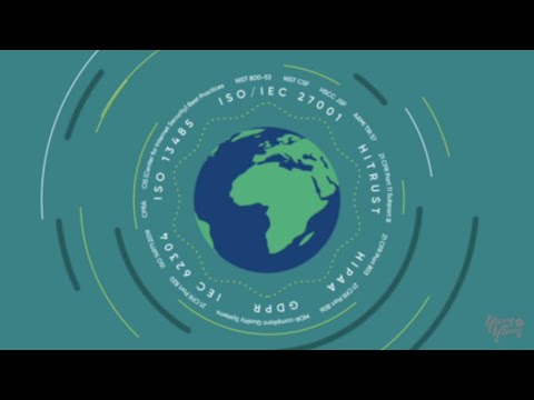
Healthcare technology creates an interesting design problem. The video has to be understandable to somebody seeing the platform for the first time, while still feeling credible to people who work in pharma, healthcare, and regulated environments every day.
That was the challenge with BrightInsight.
The visual language is intentionally restrained. Information appears in a controlled order, and individual ideas have enough time on screen before the animation moves forward.
There is a temptation with sophisticated technology to make the visuals equally sophisticated. I do not think that would have helped here.
The restrained visual language keeps the animation from adding more complexity to an already complex platform.
Business context: BrightInsight secured a $101M+ Series C round and reported approximately 431% growth over the relevant period. (Mercom Capital)
#3 McGraw Hill: Motion Graphics for Digital Education
Created by Yum Yum Videos
With educational products, viewers are often trying to understand a process while also deciding whether the product will be easy to use.
For McGraw Hill, we created motion graphics videos that guide instructors and students through digital learning products and workflows.
There is nothing overly complicated about the visual language, and that is intentional.
Friendly illustrations, a steady rhythm, and clear transitions let the content do most of the work. One detail I particularly like is how quickly the animation moves on once a point has been made.
Educational videos can become exhausting when every icon, label, and diagram remains on screen after it has served its purpose. Here, the composition keeps clearing space for the next idea.
Business context: The videos were used during a period that included approximately 95% instructor adoption of the Evergreen product and +7.2% YoY digital revenue growth, with Evergreen contributing 61% of total digital revenue. (AInvest)
SaaS & Tech Motion Graphics Examples
Software often has the opposite problem of a physical product: almost everything important is happening somewhere you cannot see.
That makes SaaS particularly well suited to motion graphics.
#4 Chargebee: Explaining Subscription Billing Without Living Inside the UI
Created by Yum Yum Videos
.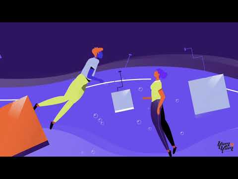
Chargebee could have explained subscription billing with a sequence of product screens. We chose a more conceptual route.
The videos use visual metaphors to explain billing logic and RevOps workflows. That keeps the explanation focused on the system behind the interface.
It also gives the videos a longer useful life.
This is something we consider often when working with software companies. Interfaces change. Buttons move. Dashboards get redesigned. A video built completely around product screens can start looking old much sooner than the underlying message.
Using abstraction selectively lets you explain the logic of a product without tying every second of the animation to the current UI.
Key milestones
- $55M Series F in October 2020
- $125M Series G in April 2021, reaching a $1.4B valuation
- A later $250M funding round at a $3.5B valuation (TechCrunch)
- More than 400K views across platforms
#5 Slack: Motion That Feels Like the Product
Slack is worth watching for the transitions alone.
Actions flow naturally from one to the next, and the animation rarely feels as if it has stopped just to explain the interface.
What I would borrow from this one: the motion behaves like the product itself.
#6 Reddit: Keeping a Product Launch Recognizably Reddit
.
Reddit’s animation is energetic, playful, and unmistakably connected to the platform.
A more polished corporate style might actually have made the video worse.
The lesson here is simple: motion design should feel like it belongs to the brand using it.
Healthcare & Biotech Motion Graphics Examples
Healthcare animation does not always need sophisticated motion. Sometimes slowing the explanation down is the better decision.
#7 MedVector: When Whiteboard and Motion Graphics Work Together
MedVector is interesting because it does not fit neatly into one animation category.
The main technique is whiteboard animation, but animated icons, transitions, pacing, and other motion graphics elements appear throughout the piece.
The drawing process naturally controls the amount of information on screen. The viewer sees one idea develop before the next one appears.
For medical topics, that can be especially useful. Adding more visual information does not necessarily make a difficult subject easier to understand.
Business context: The video was used during an early stage of the company that included a $3.5M funding round.
You can see more of the project in the MedVector case study.
If you are considering this style, our guide to the best whiteboard animation companies goes deeper into how different studios approach whiteboard work.
#8 RDMD, Now AllStripes: Putting the Patient First
Created by Yum Yum Videos
.
This was a case where the structure of the story mattered as much as the animation style.
AllStripes needed to explain how people with rare diseases could contribute medical data to research. That meant dealing with privacy, consent, data collection, and scientific research, all within one narrative.
Starting with the mechanics would have made the video feel clinical very quickly.
So the story stays centered on the patient.
Once viewers understand why somebody would use the platform, the technical process becomes much easier to explain.
That is a lesson that applies well beyond healthcare: sometimes the easiest way to explain a complicated system is to start with the person using it.
Key milestones
- $14M Series A in 2020
- $50M Series B in 2021
- Acquired by PicnicHealth in 2023
- The video was also used during the company transition from RDMD to AllStripes.
#9 Brain Power by Neurocore: A Different Pace for Mental Health
This one is much quieter visually than many of the SaaS examples.
That is exactly why I included it.
Mental health communication benefits from giving the viewer room to process what is being said. The softer shapes and slower pace suit the subject.
Good pacing is not always fast pacing.
Financial & Fintech Motion Graphics Examples
Finance is full of things that exist mostly as numbers, transactions, systems, and rules.
Motion graphics can give those invisible ideas a physical logic.
#10 Advisors Capital Management: Videos Built to Stay Useful
Created by Yum Yum Videos
A lot of marketing videos are made for a campaign and disappear six months later.
The Advisors Capital Management videos took a different route. They were developed as long term educational assets for the website and have continued to appear across core pages for years.
That changes the design decision.
A video intended to stay useful for several years cannot depend too heavily on whatever visual trend happens to be popular during production.
The animation is therefore deliberately structured. Investment concepts unfold in sequence, and the graphic system is clean enough to support the explanation without becoming the subject itself.
For financial communication, I think that is the right tradeoff.
Business context
- $9.5B in Assets Under Management
- 14,000+ client accounts in 2025
- Ranked among the Top 100 RIAs by Financial Advisor Magazine
You can see the full project in our Advisors Capital Management case study.
#11 PayPal: Making an Invisible Payment Flow Visible
How do you show money moving through a digital payment system?
PayPal does not try to recreate the entire infrastructure.
Lines, direction, and simple transitions give the viewer just enough information to understand where a payment comes from and where it goes.
That economy is what makes the video interesting.
#12 Charles Schwab: Motion Graphics Without a Product Demo
.
Charles Schwab takes a more conceptual route.
The video uses animation, typography, narration, and sound to communicate the company’s philosophy around investing.
There is very little traditional product explanation here, which is precisely why it belongs on the list. Motion graphics can explain ideas as well as systems.
Education & EdTech Motion Graphics Examples
Education videos often have several audiences at once.
Teachers, administrators, students, and families may all watch the same piece for different reasons.
#13 Remind: Explaining Tutoring to School Administrators
Created by Yum Yum Videos
.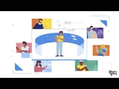
Remind Tutoring needed to make sense at the district level.
That changes the questions the video has to answer.
An administrator is not only asking, “What does this product do?” They also want to know how tutoring fits into the existing platform, how it can be implemented, and what the experience looks like at scale.
So the video spends less time selling the general idea of tutoring and more time walking through how the service works.
The structure follows the questions the viewer is likely to have.
That seems simple, but it is one of the most useful principles in explainer video production: build the sequence around the audience’s questions, not the company’s feature list.
Key context
- Used in 80% of U.S. public schools
- 30M monthly active users and 2M+ teachers
- Video featured by EdTech Digest and The Learning Counsel
- Remind Tutoring approved by the Virginia Department of Education under its Learning Acceleration Grants Program
#14 Guide Your Family’s Tech Journey: Keeping Digital Safety Approachable
Online safety can become intimidating very quickly, especially when the audience includes parents and children.
This video keeps the visual language friendly and gives each idea enough time to land.
I would study the tone more than the animation technique here. Nothing in the visual language makes the subject feel scarier than it needs to be.
#15 Duolingo: Animation That Is Part of the Product
Duolingo is different from almost every other example in this article.
Motion is built into the learning experience itself.
Characters react, progress gets visual feedback, and interface movement tells the user what happened.
The animation is not sitting on top of the product. It is part of how the product communicates.
Enterprise, Industrial & Infrastructure Motion Graphics Examples
There are some things a camera simply cannot show well.
Internal manufacturing processes, cybersecurity architecture, and advanced engineering systems are good examples.
#16 Sintavia: Showing What Happens Inside Advanced Manufacturing
Created by Yum Yum Videos
Sintavia works with additive manufacturing for aerospace and defense.
The subject immediately creates a production challenge. How do you explain what is happening inside a highly technical manufacturing process when much of it cannot be filmed in a useful way?
Motion graphics let us isolate individual stages and show relationships between production workflows, material science, and quality controls.
This is one of the situations where animation has a very practical advantage over live action.
A camera records what physically exists in front of it. Animation lets you decide what the viewer needs to see.
For technical communication, that distinction can make an enormous difference.
Business context: Sintavia later received a $106.7M U.S. Department of Defense contract related to hypersonic propulsion programs. (3D Natives)
The video was also referenced by specialized aerospace and manufacturing publications.
You can see more in the Sintavia case study.
#17 Cisco Secure Client: Drawing the Network You Cannot See
Cybersecurity is invisible until something goes wrong.
Cisco uses layered vector animation to show how remote access, VPN, endpoint protection, and Zero Trust systems connect.
The strongest decision here is separating the network into layers. Viewers do not have to understand everything at once.
#18 Chemistry and Energy Efficient Buildings: Put the Data Where It Matters
This example pairs research and data directly with the visual idea being discussed.
It sounds obvious, but technical videos get this wrong all the time.
A statistic is much easier to understand when the viewer already knows what question it is answering.
Agriculture & AgTech Motion Graphics Examples
Agriculture may seem like a very physical industry, but modern AgTech depends heavily on data, prediction models, satellite information, and software.
Those parts are ideal for animation.
#19 Agrio: Turning Crop Data Into a Visual Workflow
Created by Yum Yum Videos
Agrio uses technology to detect crop disease and help growers respond to problems in the field.
That means the video has to connect two very different worlds: complex data processing and a practical decision made by a farmer.
The explainer separates satellite data, mobile scans, disease prediction, and alerts into individual visual steps.
I like that approach because it avoids turning the video into a feature list.
The viewer sees where the information comes from, what happens to it, and how it eventually becomes something useful in the field.
That sequence is more meaningful than simply showing a series of product capabilities.
Key context
- More than 500K app downloads on Google Play
- Adoption across dozens of countries
- The video has been used on the website, app listing, and across agritech communities.
#20 Better Light, Better World: Knowing When to Stop Explaining
This piece could easily have gone much deeper into the underlying agricultural science.
It does not.
Simple visual metaphors connect the technology with crop outcomes and leave the deeper technical detail outside the video.
Knowing what not to explain is part of good explainer video work too.
Creative, Editorial & Brand Motion Graphics Examples
The next examples are different.
They are not necessarily trying to sell software or explain a business model. Some are editorial pieces. Others are brand stories or experiments in motion itself.
#21 STUXNET: Giving Cyberwarfare a Visual Geography
STUXNET deals with malware, cybersecurity, geopolitics, and a long chronological sequence of events.
The animation gives all of that information a visual geography.
Timelines establish when things happened. Maps establish where. Graphic sequences explain what the malware was doing.
For me, that is the strongest part of the piece. The animation is organizing the information, not merely decorating the narration.
#22 Bitcoin Explained in a Nutshell
Bitcoin can become confusing very quickly when the explanation stays verbal.
This video uses simple shapes and relationships to make decentralization and transactions visible.
Nothing here needs elaborate illustration. The simplicity is doing useful work.
#23 UEFA Nations League Explained
.
Tournament structures are basically diagrams waiting to happen.
The UEFA video uses brackets, typography, and movement to show how teams move through the competition.
Once viewers can see the structure, the rules become much easier to follow.
#24 The Bélo by Airbnb: Building the Logo in Front of the Viewer
.
Airbnb does something clever here.
The viewer does not simply see the Bélo logo and then hear an explanation of what it means. The animation builds the symbol from the concepts behind it.
People, places, and other visual ideas eventually resolve into the final mark.
The logo itself becomes the ending of the story.
#25 Google One: Making Cloud Storage Feel Physical
Cloud storage has no obvious physical form.
Google One gives it one.
Subtle depth, movement, and dimensional elements make digital storage feel a little more tangible without turning it into a literal object.
Short, simple, effective.
#26 Coffee in 200 Frames: What a Constraint Can Do
.
This one is here for animators.
The entire piece is built around a 200 frame constraint, turning an everyday process into an exercise in timing and transformation.
The limitation is part of what makes it interesting.
#27 Be Work Happy: Letting Movement Carry the Emotion
There are no realistic office scenes doing the heavy lifting here.
Abstract shapes respond to the narration through rhythm, color, and movement.
For this particular idea, literal imagery probably would not explain it any better.
#28 When You Say You’re a Swimmer: How Little Animation Is Enough?
This is probably one of the simplest looking videos on the list.
Line art, limited movement, sound, and timing carry almost everything.
I like it because it pushes against the assumption that better animation means adding more motion.
Sometimes removing visual information gives the story more room.
#29 Thermo Fisher Scientific: Organizing Scientific Information
.
Thermo Fisher Scientific uses motion graphics to break scientific processes into individual stages.
That organizational role matters.
When several technical ideas appear together, viewers can lose the sequence before they lose the meaning of any individual term.
The animation gives each part of the process its own place and moment.
#30 DestinationZero: One Video, Several Jobs
DestinationZero has to recap a program, explain what happened, and announce an outcome.
The animation gives those different sections a common visual language.
Without that continuity, the piece could easily feel like three presentations stitched together.
What I Look for Before Approving a Motion Graphics Video
After more than a decade producing animated videos, these are some of the questions I find myself coming back to.
Can I Understand the Idea Without Fighting the Animation?
Motion should tell the viewer where to look.
If several things are moving while the narration introduces another idea, the animation may be technically impressive and still make the message harder to understand.
I would rather remove a beautiful transition than keep one that competes with the story.
Is There Actually a Reason for This to Move?
This sounds almost too basic, but it is a useful test.
Movement can explain a sequence, a relationship, a change, or a process.
If a static illustration could communicate exactly the same thing just as well, I would question whether the extra animation is helping.
Will This Still Feel Right Two Years From Now?
Trends are not automatically bad.
The problem comes when a video depends so heavily on one visual trend that it stops feeling like the brand once that trend passes.
This matters especially for videos intended to live on a homepage, product page, or sales presentation for several years.
Does This Style Belong to This Company?
A healthcare video does not need to move like a Reddit launch.
A financial services company probably should not look like a children’s educational app unless there is a very good reason.
Before approving a style, I want to understand why that visual language belongs to that particular message and audience.
Are We Controlling the Details That Actually Matter?
AI tools can generate visual material quickly, and they can be useful in parts of the animation process.
Custom motion graphics become especially valuable when the project needs precise control over sequencing, brand consistency, technical information, product behavior, or exactly what the viewer sees at each moment.
That is usually where the difference matters most.
Frequently Asked Questions About Motion Graphics
What are motion graphics?
Motion graphics are graphic elements such as typography, icons, shapes, illustrations, diagrams, and other visual assets that are animated to communicate an idea.
They are commonly used to explain products, systems, processes, data, or concepts that are difficult to show with traditional footage.
When should you use motion graphics instead of live action?
Motion graphics are especially useful when the subject is difficult to film.
Software workflows, data, financial transactions, scientific processes, infrastructure, and abstract concepts are common examples.
Live action may make more sense when people, physical environments, demonstrations, or human emotion are central to the story.
Are motion graphics still effective in 2026?
Yes, when motion is actually helping the communication.
Animation by itself does not make a video effective. The important question is whether movement makes the subject clearer, easier to follow, or easier to visualize.
How long should a motion graphics video be?
Many commercial motion graphics and explainer videos fall between 60 and 120 seconds.
That is not a rule. A simple product message may need less time, while a technical or educational video may need considerably more.
How much does a motion graphics video cost?
In our 2026 pricing research, 61 usable quotes for a custom 60 second animated explainer video produced a median price of $9,680.
That figure is a useful market reference rather than a fixed price. Length, illustration complexity, animation style, revisions, and the production team can all change the final cost.
For a deeper breakdown, see our guide to animation cost.
How do you keep a motion graphics video from looking outdated?
I would start by separating the parts that are likely to change from the parts that are not.
Product interfaces, pricing, feature names, and trend driven visual effects can date a video quickly. A strong brand system, good visual metaphors, and a story built around the underlying problem usually have a longer useful life.
For SaaS projects in particular, this is something worth discussing before animation begins.
Final Thoughts
After looking at all 30 examples, I do not think there is one motion graphics style that consistently works better than the others.
Accelerant needed to make a sophisticated insurance platform understandable to investors. MedVector needed to slow a healthcare explanation down. PayPal had to visualize an invisible transaction. Airbnb used motion to explain the thinking behind a logo.
Those are very different problems.
And that is probably the most useful way to think about motion graphics:
Start with the thing the viewer needs to understand. Then decide what should move.


Victor Blasco
Co-founder of Yum Yum Videos | Explainer Video & Video Marketing Expert
Victor Blasco has over 25 years of experience in animation and film production. For the past 14+ years, he has worked with companies to create explainer and marketing videos that simplify complex ideas and drive business results.
His work has supported global brands like Amazon and McKesson, as well as startups that raised over $2B and reached unicorn or IPO stages.
Victor shares insights based on real client work. His contributions have been published on platforms like Social Media Examiner, and he has been featured or quoted in outlets such as Forbes.