30 Best Motion Graphics Examples of 2026 With Real Business Results

Co-founder of Yum Yum Videos | Explainer Video & Video Marketing Expert
Motion graphics animate graphic design elements to show how something works, moves, or changes. They are especially useful when the subject is hard to show directly, such as a software workflow or the movement of data through a system.
Software and finance use motion graphics constantly because so much of the subject is invisible. The same logic applies in healthcare and education, where a process can be easier to follow once it has a visual sequence.
After producing more than 1,000 videos since 2012 at Yum Yum Videos, I have learned to value restraint. Several examples in this list use very little movement and still explain the subject clearly. Each movement needs a visible job: it should help the viewer follow what happens next or see how elements relate.
I selected 30 motion graphics examples from a mix of technical, commercial, and brand work. Some were created by our team. Others come from companies and studios whose work I still return to when I want to study a particular choice in pacing, transitions, illustration, or visual storytelling.
For several companies, I also include funding, valuation, adoption, or revenue figures to give some context about the business at the time. Those numbers describe the company and its growth. They are not meant to suggest that the video caused those results.
What I Look for in a Good Motion Graphics Video
I start with clarity. If the viewer has to work harder because of the animation, something has gone wrong.
Pacing comes next. Every idea needs enough time to register before the next one arrives. That sounds obvious, but it is one of the easiest things to lose when a production team becomes excited about transitions and movement.
Every important movement also needs a reason. A transition might carry the viewer into the next step, while a moving line can show a connection that would be harder to read in a still frame.
Motion Graphics Examples From Companies With Major Business Milestones
#1 Accelerant: Explaining a Complex Insurance Platform
By Yum Yum Videos
.
Accelerant needed to explain a sophisticated insurance platform to investors, partners, and people already familiar with financial infrastructure.
We created a series of nine videos around the same geometric visual system. Shapes connect, separate, move between areas, and regroup as different parts of the insurance exchange are introduced.
That gave us a clean way to explain the system gradually. The viewer sees one relationship, understands it, and then moves to the next part of the model.
The visual style also fits the company. The precise geometry and controlled movement feel appropriate for a business built around data, risk, and financial infrastructure.
Accelerant later raised $724M in its 2025 IPO and reached a market value of approximately $6.4B at its debut (Reuters).
You can see more of the project in our Accelerant case study.
#2 BrightInsight: Organizing a Clinical Workflow
By Yum Yum Videos
.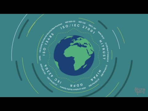
Healthcare technology can become difficult to follow quickly. A single platform may involve unfamiliar terminology, regulated workflows, and different people using it for different reasons.
For BrightInsight, we kept the visual language relatively restrained. One concept appears, stays on screen long enough to register, and then gives way to the next.
There is also very little decoration competing with the explanation. The viewer has enough information to understand the workflow without having to process a busy composition at the same time.
BrightInsight raised more than $101M in Series C funding (Mercom Capital).
#3 McGraw Hill: Motion Graphics for Digital Education
By Yum Yum Videos
.
Educational product videos need to explain how something works while also making the experience feel manageable for the person watching.
For McGraw Hill, we created videos that guide instructors and students through digital learning products and workflows.
The illustrations are friendly and the pace stays steady, but the detail I notice most is how quickly finished elements leave the screen. Labels and diagrams disappear once they have done their job, so the composition keeps making room for new information.
McGraw Hill’s digital revenue grew 7.2% compared with the previous year in fiscal 2026 Q1. Evergreen reached approximately 95% instructor adoption and represented 61% of digital revenue (AInvest).
SaaS & Tech Motion Graphics Examples
Software is a natural fit for motion graphics because the interface shows only part of what is happening. Behind it, data moves between tools and automations run without the user seeing the underlying process.
Animation gives those hidden processes a visual order.
#4 Chargebee: Explaining Subscription Billing Beyond the Interface
By Yum Yum Videos
.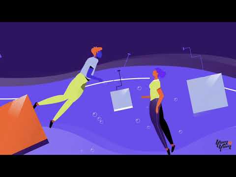
Chargebee could have explained subscription billing mainly through product screens. We chose to spend more time on the logic behind the software.
Visual metaphors help explain billing, subscriptions, and RevOps workflows while keeping the viewer focused on how the system behaves.
Software interfaces change constantly. That gives this approach a practical advantage: a video built around product logic can remain useful after a dashboard redesign.
Chargebee raised $55M in October 2020 and another $125M in April 2021, when the company reached a $1.4B valuation (TechCrunch). A later funding round valued the company at $3.5B.
#5 Slack: Making the Motion Feel Like the Product
.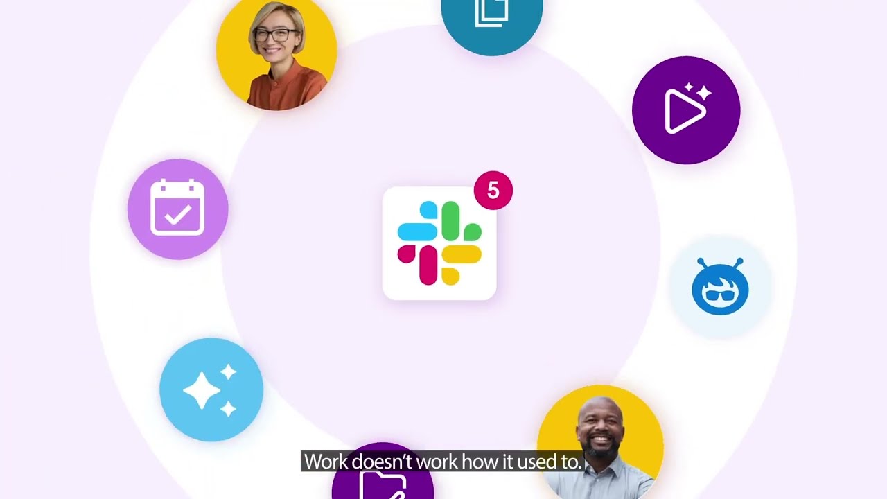
The transitions are the first thing I notice in this Slack video.
One action flows directly into another, so the video keeps moving without feeling like a sequence of disconnected interface screenshots.
The timing also resembles the product itself. Small reactions and quick changes create the same sense of responsiveness people associate with using Slack.
#6 Reddit: Animation With a Recognizable Personality
.
Reddit uses quick movement, playful timing, and a deliberately loose visual style.
The slightly awkward energy feels like Reddit. Quick movement and a deliberately loose visual style keep that personality intact instead of smoothing it into a generic corporate look.
Healthcare & Biotech Motion Graphics Examples
Healthcare videos often have to introduce unfamiliar information without overwhelming the viewer. That makes pacing and visual hierarchy especially important.
#7 MedVector: Combining Whiteboard and Motion Graphics
.
MedVector combines whiteboard animation with icons, transitions, and other motion graphics elements.
The drawing process controls how much information appears at once. One idea develops in front of the viewer before the next element arrives.
That pace works particularly well for a medical explanation because the audience rarely has to process several unfamiliar concepts at the same moment.
The project was created during an early stage of the company that included a $3.5M funding round.
You can see more in the MedVector case study, or compare other approaches in our guide to whiteboard animation companies.
#8 RDMD, Now AllStripes: Starting With the Patient
By Yum Yum Videos
.
RDMD, which later became AllStripes, needed to explain how people with rare diseases could contribute their medical data to research.
The story had to cover privacy, consent, data collection, and scientific research without turning into a technical lecture.
We began with the patient and the reason someone might want to participate. Once that motivation is clear, consent and data collection have a context the viewer already understands.
RDMD raised $14M in Series A funding in 2020 and $50M in Series B funding in 2021. PicnicHealth acquired AllStripes in 2023.
#9 Brain Power by Neurocore: Slowing the Pace Down
.
This video is noticeably quieter than most of the software examples in the article.
The shapes are softer, pauses are longer, and fewer things change at once. That gives the narration more room and suits a mental health topic where the viewer may need more time to process what is being said.
Here, the slower pace gives each idea more room before the next one arrives, which suits the subject better than the quick rhythm used in many software videos.
Financial & Fintech Motion Graphics Examples
Finance often asks viewers to follow things they cannot see directly. Money moves, risk changes, and numbers only make sense in relation to one another. Motion graphics can give those relationships a visible path.
#10 Advisors Capital Management: Designing for a Long Lifespan
By Yum Yum Videos
.
We developed the Advisors Capital Management videos as educational assets for the company’s website, and several have remained on important pages for years.
That expected lifespan affected the design. We avoided leaning heavily on visual trends and kept the animation centered on the investment concepts themselves.
The graphic system stays fairly quiet while the ideas unfold in sequence. That balance has helped the videos remain useful well beyond a short campaign.
Advisors Capital Management managed $9.5B in assets and served more than 14,000 client accounts in 2025.
See the full project in our Advisors Capital Management case study.
#11 PayPal: Showing How a Digital Payment Moves
.
PayPal takes something invisible and gives the viewer a simple visual path to follow.
Lines establish direction, transitions show movement, and the audience can see where the payment begins and where it ends.
The video shows the relationships needed for the explanation without trying to recreate the entire payment infrastructure.
#12 Charles Schwab: Explaining an Idea Without a Product Demo
.
Charles Schwab uses typography, animation, narration, and sound to communicate a philosophy around investing.
There is very little traditional product demonstration. The motion is there to support an idea rather than explain an interface.
Education & EdTech Motion Graphics Examples
Sometimes the same education video has to work for people on opposite sides of the experience, from administrators deciding whether to adopt a tool to students or families who may use it.
#13 Remind: Explaining Tutoring to School Administrators
By Yum Yum Videos
.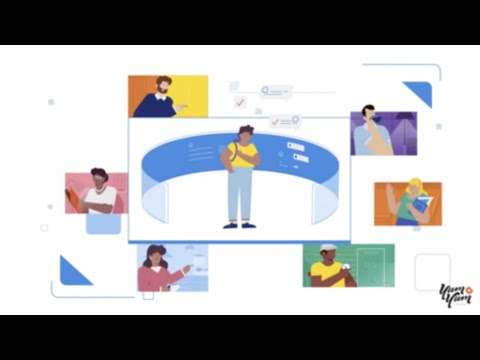
Remind Tutoring needed to make sense to school administrators evaluating the service at district level.
The video answers practical questions as they arise. How does tutoring fit into Remind? How would a school implement it? What does the experience look like when used at scale?
Features appear when they help answer one of those questions, which gives the sequence a natural reason to move forward.
Remind reaches 80% of U.S. public schools and has reported 30M monthly active users and more than 2M teachers. Remind Tutoring was also approved by the Virginia Department of Education for its Learning Acceleration Grants Program.
#14 Guide Your Family’s Tech Journey: Making Digital Safety Approachable
.
This digital safety video uses friendly illustration and generous spacing to keep the subject approachable for parents and children.
Ideas arrive at a comfortable pace, and the screen never becomes overloaded with warnings, icons, or technical information.
The tone stays serious without turning digital safety into a fear based message.
#15 Duolingo: When Animation Is Part of the Product
.
Duolingo uses animation throughout the learning experience itself.
Characters respond to progress, the interface reacts to answers, and movement gives immediate feedback about what happened and what comes next.
Because users already know that visual language from the app, it carries naturally into Duolingo’s videos as well.
Enterprise, Industrial & Infrastructure Motion Graphics Examples
Technical processes inside machines or networks are often invisible to the camera. Motion graphics let you isolate those parts and control exactly what appears on screen.
#16 Sintavia: Looking Inside Advanced Manufacturing
By Yum Yum Videos
.
Sintavia works with additive manufacturing for aerospace and defense.
Much of the production process happens inside specialized equipment or at a scale that is difficult to capture clearly with a camera.
Animation allowed us to isolate stages of the process and connect manufacturing workflows with material science and quality control. We could also remove physical details that were accurate but unnecessary for the explanation.
Sintavia later received a $106.7M U.S. Department of Defense contract related to hypersonic propulsion programs (3D Natives).
See more in the Sintavia case study.
#17 Cisco Secure Client: Showing a Cybersecurity Network
Cisco uses layered vector animation to map remote access, VPN, endpoint protection, and Zero Trust systems.
The network appears gradually, giving the viewer time to understand one connection before another part of the system enters the picture.
That turns a dense cybersecurity diagram into something much easier to follow.
#18 Chemistry and Energy Efficient Buildings: Showing Data at the Right Moment
.
This video places research and statistics beside the idea each number supports.
The viewer already understands the question when the data appears, so the statistic has an immediate purpose.
It is a simple decision, but one that makes technical information much easier to absorb.
Agriculture & AgTech Motion Graphics Examples
Modern agriculture mixes physical work in the field with a growing digital layer, from satellite data to mobile software.
Motion graphics can show how those digital systems eventually lead to a decision in the field.
#19 Agrio: Following Crop Data From Input to Action
By Yum Yum Videos
.
Agrio uses technology to detect crop disease and help growers respond to problems.
The video follows the information from a satellite or mobile scan through disease prediction and, finally, to the alert the farmer receives.
The viewer can follow where information enters the system, what happens to it, and what eventually reaches the farmer. Product features become parts of one workflow instead of appearing as a disconnected list.
Agrio has recorded more than 500K app downloads on Google Play.
#20 Better Light, Better World: Deciding What to Leave Out
.
The science behind this video could support a much longer explanation.
Instead, simple visual metaphors connect the technology with crop outcomes, while deeper technical information stays outside the piece.
That editing decision is important in explainer work. The video stops once the audience has enough information to understand the point.
Creative, Editorial & Brand Motion Graphics Examples
The final examples move beyond traditional software and product explainers into editorial and brand work, with a few animation exercises mixed in. Many of the same production principles still apply.
#21 STUXNET: Giving a Complex Story a Visual Structure
.
STUXNET deals with malware, cybersecurity, geopolitics, and a long sequence of events.
The video uses timelines for chronology and maps for location, then switches to graphic sequences when it needs to show what the malware was doing.
Together, those elements give the viewer a structure that would be difficult to hold in memory through narration alone.
#22 Bitcoin Explained in a Nutshell
.
Bitcoin can become difficult to follow when decentralization and transactions stay entirely verbal.
This video uses a small set of shapes, connections, and movements to show those relationships.
The illustration remains simple, so attention stays on who connects to whom and where a transaction moves next.
#23 UEFA Nations League Explained
.
A tournament format already has a natural visual structure.
Brackets, typography, and movement show how teams progress through the Nations League. Once the structure appears on screen, the rules require much less verbal explanation.
#24 The Bélo by Airbnb: Building a Logo Through Animation
.
Airbnb builds the Bélo mark from the ideas behind it.
People, places, and other visual concepts appear first and gradually resolve into the final logo.
By the time the mark appears, the viewer has already seen the thinking behind it. The logo becomes a natural ending to the story.
#25 Google One: Giving Cloud Storage a Sense of Space
.
Cloud storage has no obvious physical shape, so Google One creates one through depth, movement, and dimensional forms.
The visual metaphor gives storage a sense of space and capacity while still feeling connected to a digital product.
#26 Coffee in 200 Frames: Working With a Constraint
.
The animator works within a limit of 200 frames.
That fixed duration shapes every transition and forces an everyday process into a tight rhythm. Every movement has to justify the time it occupies.
The production limitation ends up influencing the creative idea itself.
#27 Be Work Happy: Using Movement to Carry Emotion
.
Abstract shapes respond to the narration through rhythm, color, scale, and movement.
The subject is emotional rather than procedural, so movement can carry much of the feeling without relying on literal office scenes.
#28 When You Say You’re a Swimmer: Doing More With Less
.
Line art, restrained movement, sound, and timing carry almost the entire piece.
Because fewer things move, each change becomes more noticeable. Sound also has more room to shape the rhythm.
I often come back to examples like this when an animation starts getting busier without becoming clearer.
#29 Thermo Fisher Scientific: Organizing Scientific Information
.
Thermo Fisher Scientific breaks scientific processes into individual stages and gives each one a clear place on screen.
That structure helps when viewers understand the individual terms but could still lose track of their order or relationship.
The animation behaves almost like a diagram that develops over time.
#30 DestinationZero: Giving Several Messages One Visual Language
.
DestinationZero has to recap a program, explain what happened, and announce an outcome inside the same video.
Typography, transitions, and graphic elements remain consistent as the purpose changes from one section to the next.
That continuity keeps the piece feeling like one story.
What I Check Before Approving a Motion Graphics Video
After working on animated videos for more than a decade, there are a few things I tend to notice immediately when reviewing a nearly finished piece.
Can the Viewer Follow the Shot?
I watch where my attention goes first.
If several elements are moving while the narration introduces another idea, the viewer may be asked to process too much at once.
I would rather remove a beautiful transition than keep one that pulls attention away from the point we are explaining.
Does the Movement Add Information?
Movement can guide the viewer to the next step or show how two objects relate.
When a movement does neither of those jobs, I usually remove it.
Some scenes improve immediately when one element moves and everything around it stays quiet.
How Long Will the Video Be Used?
A campaign video and a homepage explainer may need very different visual decisions.
For a piece that could remain on a product page or in a sales presentation for several years, I pay close attention to the brand system and try to avoid relying too heavily on a temporary visual trend.
Does the Style Fit the Audience?
A healthcare workflow should not feel like a Reddit launch, and a financial platform brings another set of expectations again.
During style review, I start with the brand and the audience. I also consider how familiar viewers are with the subject and how much information they need to process at once.
Which Details Need Precise Control?
AI tools can help during parts of the animation process.
Custom motion graphics give the production team precise control over the sequence and the details that must stay accurate, from brand assets to product behavior.
That level of control becomes particularly important when a small visual error could change the meaning of the explanation.
Frequently Asked Questions About Motion Graphics
What are motion graphics?
Motion graphics animate graphic design elements to explain a process or show a relationship over time.
They are useful when the viewer needs to see a sequence that would be cumbersome to explain with text alone.
When should you use motion graphics?
Motion graphics are a good option when movement can help explain the subject.
Software and financial systems are common examples because much of what matters happens behind the interface or outside the camera’s view.
When does live action make more sense?
Live action usually makes more sense when the message depends on seeing real people, a physical environment, or a real demonstration.
Are motion graphics still effective in 2026?
Yes. Motion graphics are still useful when movement carries information the camera cannot show directly.
For example, animation can trace a payment through a system or reveal a scientific process at a scale that would be impossible to film.
How long should a motion graphics video be?
Many commercial motion graphics and explainer videos run between 60 and 120 seconds.
The right length depends on the subject and the audience. A simple product message may take less than a minute, while a technical or educational explanation may need more time.
How much does a motion graphics video cost?
For our 2026 pricing research, we collected 61 usable quotes for a custom 60 second animated explainer video. The median quote was $9,680.
Runtime and visual complexity affect the price most, with revisions and team size adding further cost.
Our guide to animation cost per minute breaks those numbers down in more detail.
How do you keep a motion graphics video from looking outdated?
I start by looking at the elements most likely to change.
Interfaces and pricing often change first. Feature names can change too, while fashionable visual effects may date the video even when the core message still holds.
Separating those temporary elements from the core explanation can make future updates much easier.
One Final Check Before You Animate
For each scene, define the one thing the viewer should understand when it ends.
Then look at the movement. Does it make the next step or the relationship between elements easier to see? If several things move for unrelated reasons, simplify the shot until the viewer’s focus is obvious.
The 30 examples above solve very different problems, so their visual styles vary just as much.
Make the idea clear first. Then decide how it should move.

Victor Blasco
Co-founder of Yum Yum Videos | Explainer Video & Video Marketing Expert
Victor Blasco has over 25 years of experience in animation and film production. For the past 14+ years, he has worked with companies to create explainer and marketing videos that simplify complex ideas and drive business results.
His work has supported global brands like Amazon and McKesson, as well as startups that raised over $2B and reached unicorn or IPO stages.
Victor shares insights based on real client work. His contributions have been published on platforms like Social Media Examiner, and he has been featured or quoted in outlets such as Forbes.